Contents
- Introduction;
- Communication Channels;
- Analysis of the Kikoriki Brand through the Elaboration Likelihood Model;
- Analysis of the Kikoriki Brand through the Uses and Gratifications Theory;
- Evaluation of the Communication Strategy Effectiveness: Brand Strengths;
- Challenges and Limitations of the Brand’s Communication Strategy;
- Recommendations for Improving the Brand’s Communication Strategy;
- Conclusion;
- Bibliography and Image Sources.
Introduction
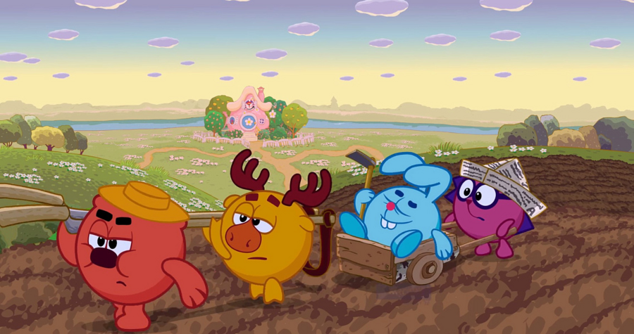
One of the most successful Russian animation brands is the Riki Group, based in St. Petersburg. It became the first animated series in Russia to make licensing and merch sales its primary source of income.
The Kikoriki (originally Smeshariki) brand actually started as a candy brand called Slastyony — the characters were also round, but the design and the number of characters changed a lot. It all began with the 2D series Kikoriki, followed by the educational 3D series Pin-Code, full-length movies, and BabyRiki for the youngest viewers. The project didn’t find much success in the West, but it became incredibly popular in China.
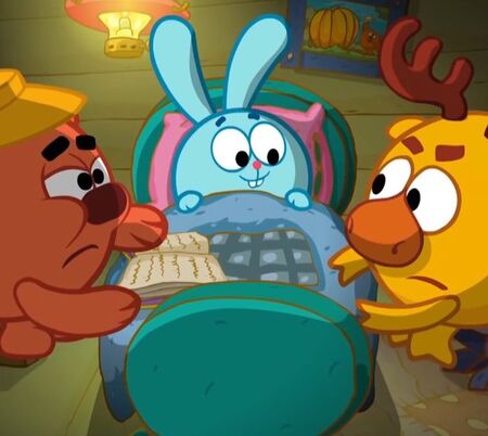
One of the key factors behind the success of the Kikoriki brand is its ability to engage multiple audience segments at once. The project’s target audience includes:
· preschool and early elementary school children; · parents (thanks to the educational and moral themes of the series — friendship, helping others, family); · teenagers and young adults up to age 30; · educational institutions (episodes are used in schools and kindergartens as supplemental material for discussing topics like ethics, safety, friendship, emotional intelligence, and science).
The positioning of the «Kikoriki» brand is built on the concept of «complex philosophy in simple language» and is described as a world without violence or negative characters.
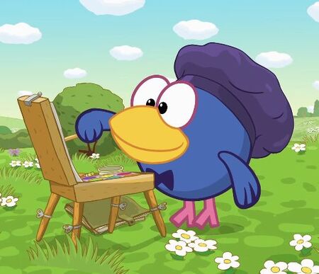
If you break this positioning down into four clear communication vectors, here’s how they look:
— A world of absolute psychological safety: In Chamomile Valley, there’s no division into «good» and «evil.» — Multi-layered content (dual-layer communication): A child sees a bright, fun story (peripheral route of perception), while an adult sees a deep existential parable about the meaning of life, loneliness, or art (central route). — Nostalgia: For the Zoomer audience (ages 18–30), the brand positions itself as an island of psychological comfort, a safe space from childhood, and a primary source of quality self-irony through intellectual memes. — Cultural code: The characters' personalities are very carefully developed and contain elements and archetypes of a distinctly «Russian» code — from the hardworking, simple bear and gardener Barry, to the intellectual Carlin with his signature phrases dating back to Tsarist Russia: «My good man, gentlemen, excellent.»
Communication Channels
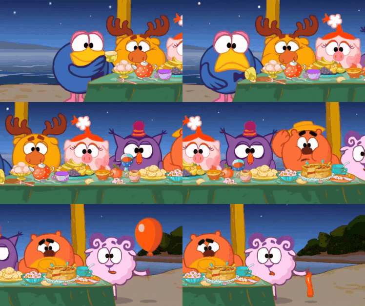
Modern communication channels have played a special role in the brand’s development. The company uses:
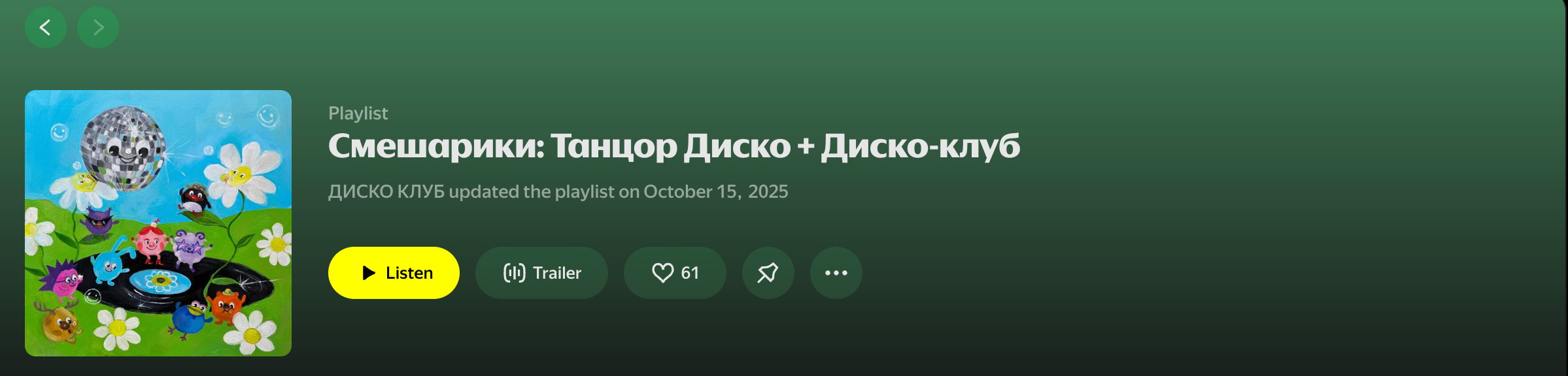
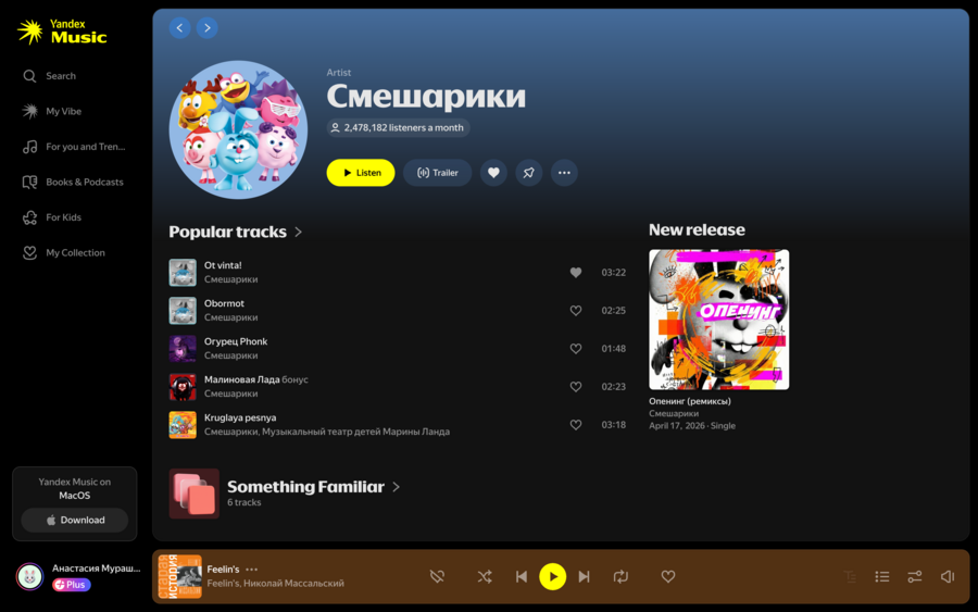
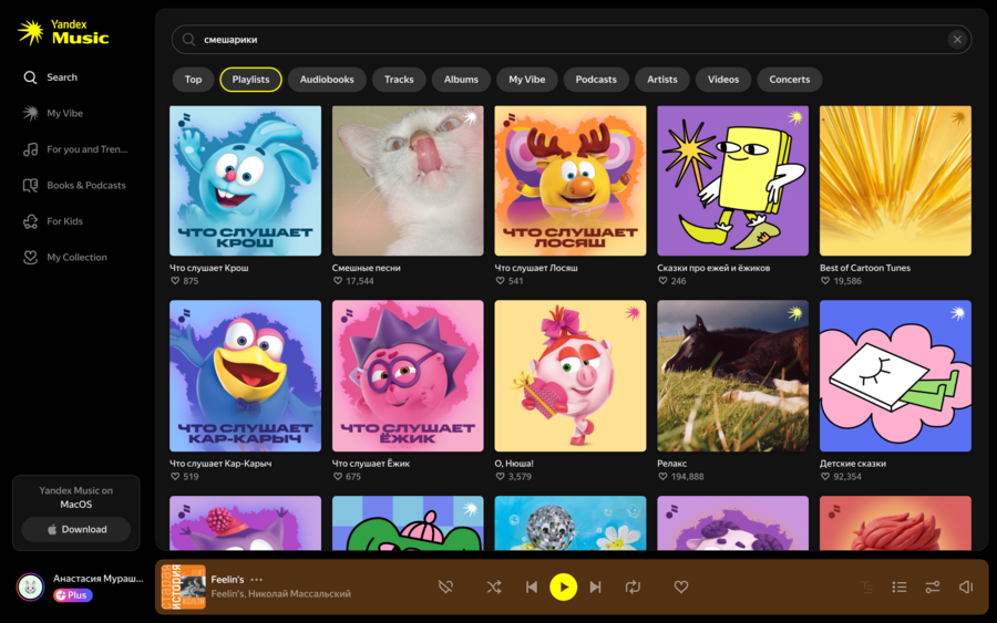
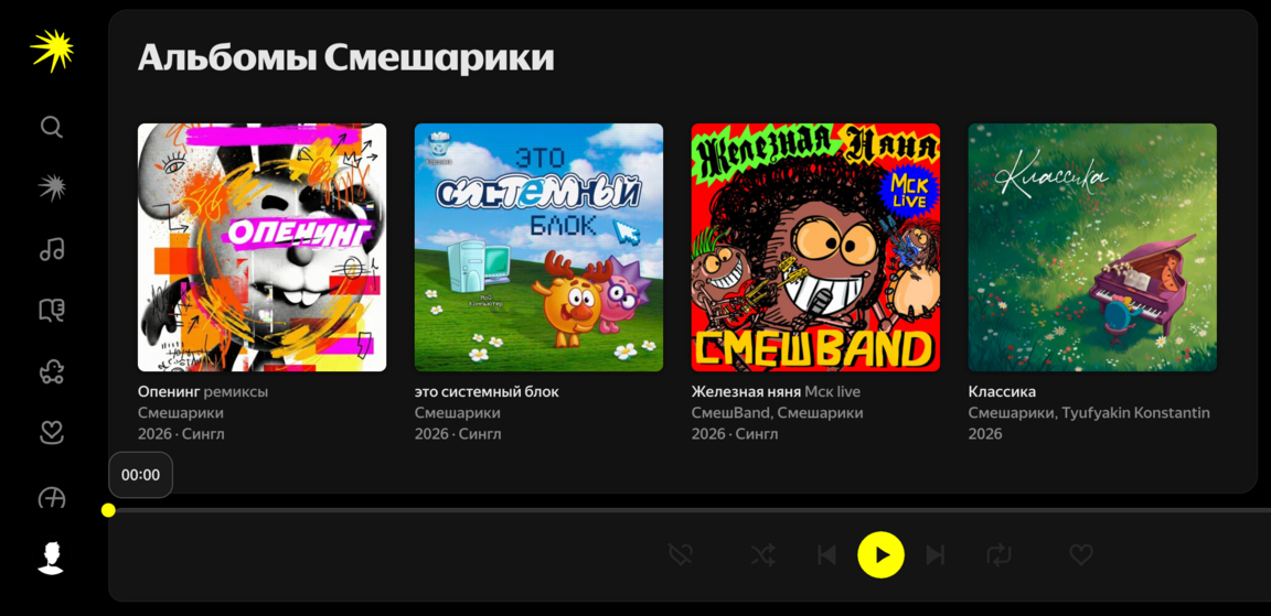
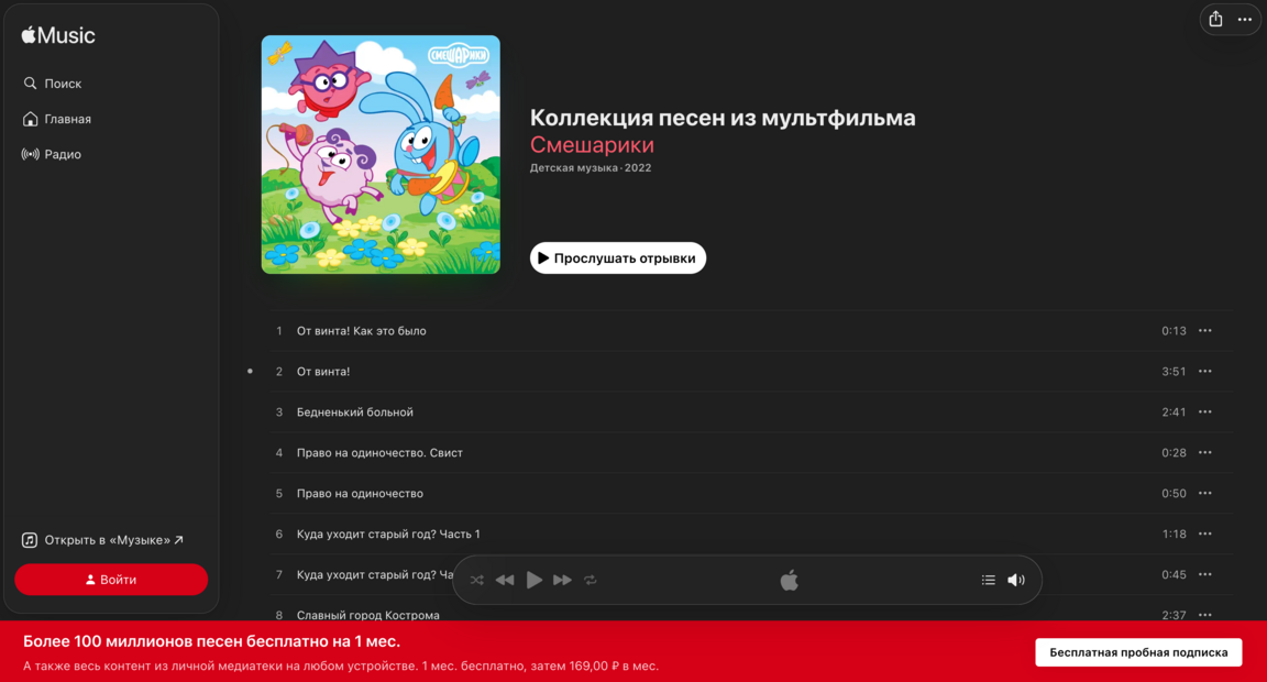
· Their own media channels (TV, video hosting — channels on YouTube, Rutube, VKvideo); · Social media (official communities on VK and Odnoklassniki; trends and character quotes in TikTok videos); · Merchandising (food products, stationery, toys, clothing); · Music (in the series, this has become a standalone product: vinyl records are released, the «Smeshband» group performs the show’s hits, and collaborations are released on Yandex.Music); · Games (mobile, board games, integrations into other universes like Roblox and Minecraft); · Own offline spaces (the «Kikoriki Theater»); · Event participation (costumed walk-around characters at VK Fest); · Print products (magazines, coloring books, story-based books, and books for adult audiences about the brand’s history); · Channels the brand doesn’t invest money in but still benefits from (meme pages, fan art, YouTube analysis videos about the characters' psychology).
«Kikoriki» is a benchmark example of 360-degree communication. The brand surrounds people everywhere: from morning yogurt and a playlist in their headphones to watching an episode on Kinopoisk in the evening and sharing memes with friends.
Main PR Strategies:
1) Nostalgia Marketing (Kidult Marketing): A notable example was the franchise’s 20th anniversary, for which the brand released vinyl records and a comic book. 2) Collaborations: Partnerships with clothing brands (Befree, Zagon, Sela) and with Yandex (the Alice smart speaker). 3) Event & Audio PR: Extending communication into the physical world through interactive experiences. The brand created a full jazz-pop-rock orchestra called «SmeshBand, ” which actively tours across the country. Concerts often feature guest performers such as Alexander Pushnoy. This further increases interest among younger audiences, many of whom grew up watching his television program „Galileo.“ 4) UGC Strategy and the Legitimation of Internet Folklore: Instead of aggressively enforcing copyright restrictions, the PR team embraced and legitimized user-generated content. The brand actively encourages the creation of mature, philosophical, and ironic memes based on its episodes. Internet users effectively become unpaid brand ambassadors.
Analysis of the Kikoriki Brand through the Elaboration Likelihood Model
The Kikoriki case (Riki Group) is an example of brilliant two-level visual persuasion that can be perfectly explained through Petty and Cacioppo’s Elaboration Likelihood Model (ELM)
1. Peripheral Route (Low Elaboration / Surface-Level Processing)
At a low level of information processing, the audience (children, tired parents, or users casually scrolling through their feeds) does not engage deeply with the content. Instead, the design persuades them to stay engaged through peripheral cues (heuristics):
— All characters are built around a perfect circular shape. On a subconscious level, circular forms are perceived as friendly, safe, and free of aggression; — Color archetypes: contrasting colors communicate a character’s personality and emotions within fractions of a second, effectively bypassing the audience’s critical analysis. Below are examples of several character colors explained from the perspective of psychological perception.
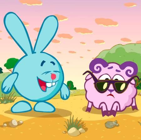
Krash (light blue): calmness, freedom, openness, spaciousness (reminiscent of the sky and water), and safety. In Krash’s case, the color is a perfect match for his archetype. He cannot stand restrictions, daily routines, lectures, or staying in one place for too long. He lives by the idea of limitless possibilities and is free from psychological barriers. He can take on virtually any idea without thinking, «That’s impossible.» According to color psychology, light blue is the color most strongly associated with creativity. It encourages reflection, deep insights, sudden understanding of complex ideas, and spiritual self-discovery. These traits are frequently demonstrated by Krash throughout the series despite his young age.
Wally (pink-lilac): Wally’s light lilac body color reflects his sensitivity, romantic nature, and dreaminess. In general, purple shades (seen in his hooves and horns) encourage inward-focused psychological processes such as reflection and self-discovery. The character’s color scheme also emphasizes his sophistication and uniqueness, as he is the only poet in Chamomile Valley.
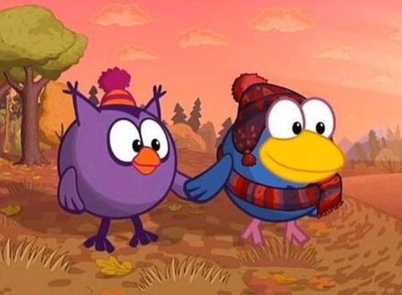
Olga (deep dark purple): Olga’s color is perceived as a symbol of wisdom. Purple has the shortest wavelength in the visible spectrum. Immediately beyond it lies ultraviolet light — a range that the human eye is physically unable to see. Wisdom is often associated with understanding what remains hidden from ordinary people and with the ability to look beyond the obvious. In addition, throughout history, purple was an expensive color that was accessible only to influential individuals with authority, experience, and social status.
Carlin (dark blue): deep shades of dark blue stimulate cognitive functions, improve decision-making abilities, and enhance the capacity to solve complex mental challenges under pressure. In the series, Carlin often takes on the role of a psychologist, mediator, or illusionist-magician. Dark blue also activates the parasympathetic nervous system, which helps reduce anxiety in viewers. Furthermore, clothing of this color was historically associated with privileged social classes, and Carlin is indeed aristocratic by nature.

Dokko (yellow and brown): brown is the color of grounding (literally the color of soil and trees). According to research, yellow stimulates idea generation and creative thinking. Dokko combines both of these qualities: practicality and reliance on facts, alongside obsession, ambition, and wildly unconventional ideas.
2. Central Route (High Elaboration / Deep Processing)
When adult viewers or members of Generation Z engage in a high level of information processing, surface-level visuals are no longer enough. At this stage, visual persuasion operates through issue-relevant arguments — hidden graphic symbolism and intertextual references. The creators embed highly sophisticated Easter eggs within the frame, designed specifically for intellectually engaged audiences.
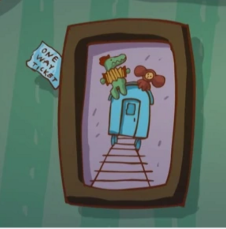
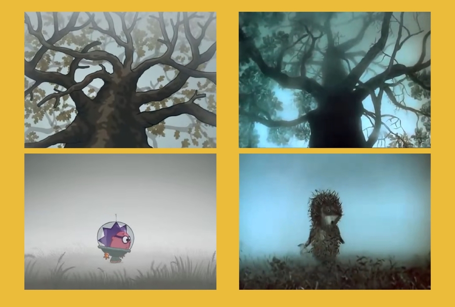
— Dokko’s phrases like «You never rest, do you?» and «My monotonous friend» are very similar to lines spoken by Sidorin in Eldar Ryazanov’s film Garage; — The framing and shadow work in the episode «The Sandwich» closely mimic the horror aesthetic of Alfred Hitchcock’s Psycho, while the episode «Black Romeo» channels Victorian gothic noir; — In many different episodes, a painting can be seen in Carlin’s house featuring famous characters from a Soviet cartoon — Gena the Crocodile and Cheburashka — riding on a blue railcar; — The line «Bravo, Wally, bravo, you son of a sheep!» is a nod to Alexander Pushkin’s famous exclamation: «Bravo, Pushkin, bravo, you son of a dog!»; — The blueprint of the robot is a reference to Leonardo da Vinci’s Vitruvian Man; — The episode «Chiko in the Nebula» is a reference to Yuri Norstein’s film Hedgehog in the Fog.

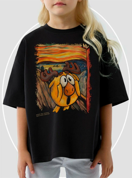
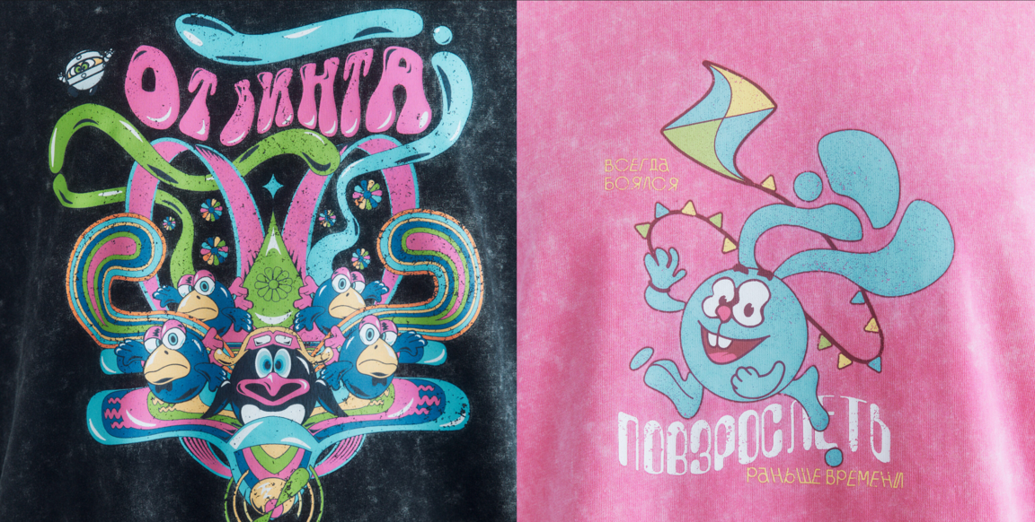
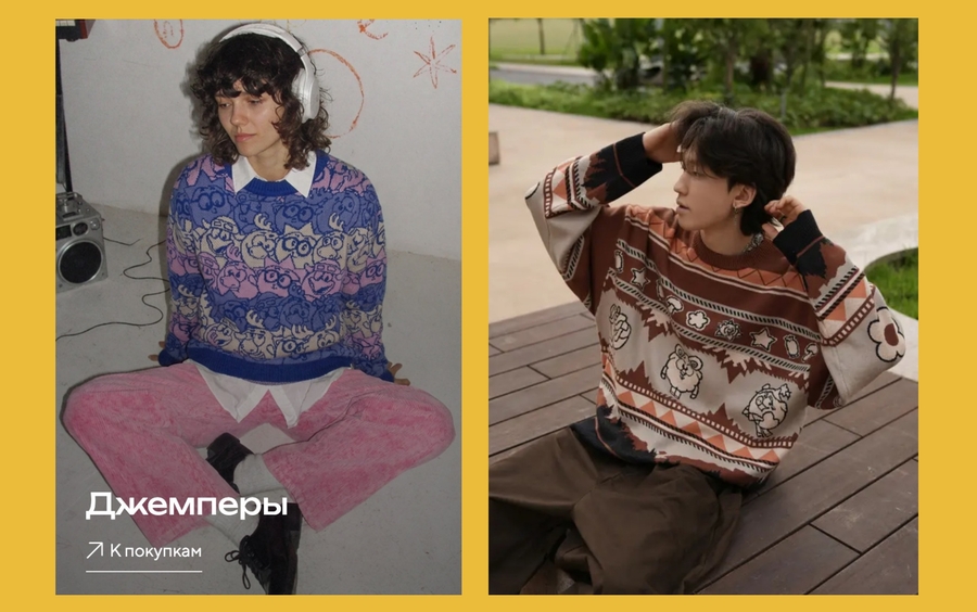
Adapting merchandise for adult audiences. Designers adjust the merch using purely external triggers:
- Trendy silhouette and cut (oversize): An adult Zoomer isn’t just buying cartoon merch — they’re buying a fashionable piece of clothing. The dropped shoulder line, relaxed fit, and current sweater style act as a strong peripheral hook;
- Sophisticated «adult» color palette: Instead of the bright, clean «kid» colors (neon pink, pure yellow), designers use muted, complex, and refined shades (indigo, lavender, dusty rose). Designers can also adapt character designs into the visual style of art masterpieces (an homage);
- Print stylization: The characters aren’t just scattered across the fabric — they’re woven into a dense, intricate graphic pattern (streetwear brand style), which from a distance reads as an abstract geometric design, and only reveals the characters on closer inspection.
Analysis of the Kikoriki Brand through the Uses and Gratifications Theory
According to the Uses and Gratifications Theory (UGT), users consciously choose specific brand media platforms to satisfy their particular psychological and social needs. Below is a detailed analysis of engagement across Kikoriki’s social media channels through the lens of five fundamental user needs. It is important to note that these needs are often fulfilled simultaneously (all five categories).
1. Cognitive Needs — Seeking Information and Knowledge To satisfy the cognitive needs of parents (how to educate and develop their children) and children (how the world works), the brand provides content through video platforms such as YouTube. Educational spin-offs like «PinCode, ” instructional compilations, and behind-the-scenes production materials created by animators (Kinopoisk) are published. Engagement in this area is reflected in view counts and the number of playlists saved by parents.
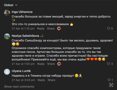
2. Affective Needs — Emotions and Enjoyment Kikoriki soundtracks are one of the brand’s most powerful tools for emotional engagement. The music generates a strong affective response: users like posts, share tracks with one another, and leave thousands of emotional comments and nostalgic memories under live performances by the band „SmeshBand“ (VK).
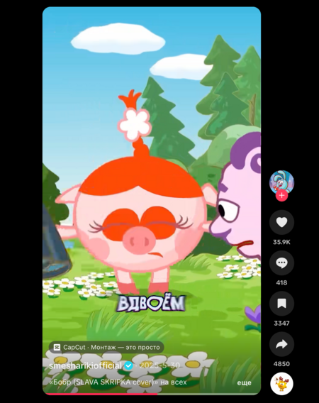
3. Social Integrative Needs — Socialization and Interpersonal Connections The brand satisfies this need among Generation Z through the official Kikoriki TikTok account. The SMM team publishes clips featuring the characters’ existential monologues, which fit perfectly into contemporary internet trends. Engagement increases significantly through the «Share» function, as users send these videos to friends as a way of saying «this is literally us, ” while also saving them for later viewing.
4. Personal Integrative Needs — Status and Identity In the brand’s Telegram channel, users leave comments, repost content to their own channels, communicate with fellow fans of the Kikoriki universe, create their own videos set to music from the series. Fans also wear merchandise featuring the characters, expressing and reinforcing their identity as members of the fandom.
5. Tension-Release (Escape) Needs — Escapism and Relaxation For the adult audience that grew up with Kikoriki, the brand’s social media communities have long become a «safe haven» and a space of mental comfort. Engagement with this content is often ritualistic in nature: users visit the official communities at the end of a difficult workday simply to scroll through the feed, relax, and unwind.



