Айдентика
РОККИ — проект визуальной айдентики и пространства крытого скейтпарка, объединенного со скейтшопом. Он объединяет место для катания, магазин, мерч и зоны общения в единую систему.
Задача проекта — передать свободу движения и неформальный характер скейт-культуры, сохранив лаконичность и узнаваемость бренда. Айдентика должна работать в разных масштабах: от браслета разового посещения до интерьера и наружной рекламы.
В основе концепции — движение, свобода и собственный ритм. «РОККИ» задуман не только как площадка для тренировок, но и как место встречи людей, объединённых интересом к скейтбордингу.
Главным визуальным мотивом стали дуги и параллельные линии. Они напоминают траектории движения, изгибы рамп и вращение колёс.
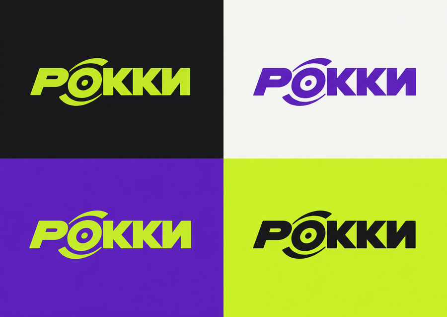
Палитра строится на сочетании глубокого фиолетового, яркого лаймового, угольного и тёплого белого. Фиолетовый создаёт крупные цветовые акценты, лаймовый выделяет детали и графические линии, а нейтральные оттенки сохраняют визуальный баланс.
Цветовые коды были предложены Perplexity, логотип был снегенерирован в ChatGPT.
Продукт и мерч
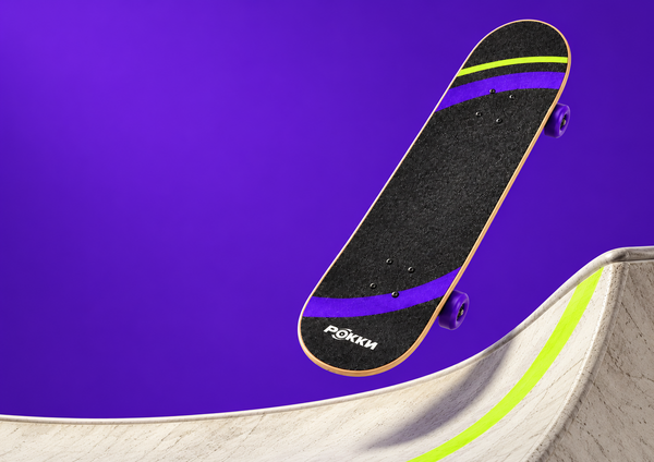
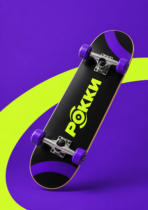
В Perplexity последовательно были проработаны браслеты разового посещения, абонемент, футболку, кепку и скейтборд. Для каждого носителя адаптировался масштаб графики и расположение логотипа, сохраняя общую систему.
Create an advertising key visual for РОККИ.
Concept: «The First Push» — the beginning of movement.FORMAT
Landscape A4 proportions, 297:210.
One continuous photographic scene.REFERENCES
Use the attached skateboard product image
for its exact shape, components and artwork.
Use the approved key visual only for colour and lighting style.SCENE & COMPOSITION
A close, low-angle shot inside a minimal indoor skatepark.
Show one rider cropped from mid-thigh down.
The skateboard moves from left to right.The rider’s front foot rests on the grip tape
near the front mounting bolts.
The rear foot is on the floor beside the board,
pushing backward in a natural skating stance.
Both legs belong clearly to the same person.Position the skateboard and legs in the lower-right
two-thirds of the frame.
Leave the upper-left area uncluttered.
Show the entire skateboard without cropping its nose or tail.PRODUCT
Preserve the reference design:
charcoal grip tape with purple arcs,
one narrow lime arc near the nose,
and a small off-white РОККИ logo near the tail.
Purple wheels, silver trucks, natural wood edges.
Graphics may be naturally covered by the rider’s shoe.
Do not show the underside artwork on the grip tape.ENVIRONMENT & STYLING
Light concrete floor, deep purple wall #5B21B6,
one flat acid-lime floor marking #C8F31D
leading in the direction of travel.
Subtle skatepark geometry in the background.
Charcoal straight-leg trousers and plain off-white
flat-soled skate shoes, no visible third-party branding.LIGHTING
Controlled directional light from the upper left.
Realistic shadows under the wheels and shoes.
Keep the skateboard and planted foot sharp.
Only a subtle motion blur on the pushing foot.Photorealistic materials and believable anatomy.
No extra limbs, extra boards, floating wheels,
text, captions, smoke, sparks or glowing trails.
use the correct shape of a classic skateboard
Create a photorealistic studio product photograph
of a redesigned РОККИ oversized T-shirt.FORMAT
Landscape A4 proportions, 297:210.
One continuous photographic scene.
No model, mannequin or visible hanger.PRODUCT
One charcoal oversized T-shirt #17171A.
Boxy silhouette, dropped shoulders,
elbow-length sleeves and a substantial matte cotton texture.
Realistic collar, stitching, fabric thickness and natural folds.GRAPHIC DESIGN
Place one small acid-lime РОККИ logo #C8F31D
on the upper chest.
Use the attached logo exactly.
Preserve the Cyrillic spelling and original proportions.Across the lower front, place one broad purple arc #5B21B6,
offset toward one side rather than centred.
The arc is cropped by the lower and side edges of the garment.Add TWO thin, evenly spaced acid-lime curved lines
running parallel to one edge of the purple arc.
The lines follow the same curvature.
Keep them clearly separated from the logo.The graphic should feel bold but spacious.
Leave substantial areas of plain charcoal fabric.
No all-over pattern, extra slogans or invented symbols.All graphics are matte screen-printed ink,
following the fabric folds naturally.
They do not glow and are not raised rubber strips.COMPOSITION
Lay the T-shirt front-side up
on a broad, low rectangular studio plinth.
The entire garment rests on the surface.
Arrange the sleeves loosely,
with only a few shallow natural folds.
Keep the chest logo and main graphic clearly visible.The plinth is large enough to support the whole shirt.
Show all garment edges within the frame.
Camera looks down at a moderate angle,
close enough to reveal the fabric and print.STUDIO SET
Deep-purple seamless floor and backdrop #5B21B6.
The low plinth is a slightly darker shade of purple.
Create a brighter violet area behind the product,
fading into darker purple toward the outer edges.A diagonal shaft of light crosses the set.
The plinth casts a long, defined,
slightly softened shadow across the floor.
Keep the garment evenly readable.LIGHTING
Neutral soft key light reveals the charcoal cotton texture.
Controlled directional light creates depth in the background.
Subtle fill preserves detail in the dark fabric.
Create a premium studio product presentation
of single-entry wristbands for the indoor skatepark РОККИ.FORMAT
Landscape A4 proportions, 297:210.
One continuous photographic scene.PRODUCT
Lightweight disposable admission wristbands
made from matte, subtly fibrous synthetic paper,
with an adhesive closure tab.
Thin, flexible and realistically proportioned.
Not silicone bracelets, fabric festival bands
or thick plastic rings.Show THREE wristbands:
— one lime wristband closed into a loose oval loop
in the foreground;
— one charcoal wristband closed into an oval loop,
slightly behind it;
— one lime wristband lying open across the front,
showing the printed strip and adhesive closure end.The two closed bands stand naturally on their lower edges.
The open strip rests on the surface with a gentle curl.
Keep every wristband fully visible.
Avoid overlaps that hide the main artwork.BRAND DESIGN
Use the attached packaging as the reference
for the purple curved bands and their cropping.
Adapt this graphic language to the narrow wristband format.
Do not invent new symbols or decorative patterns.LIME VERSION
Base #C8F31D.
Broad purple arc fragments #5B21B6,
cropped by the upper and lower edges.
Charcoal РОККИ logo #17171A.CHARCOAL VERSION
Base #17171A.
Purple arc fragments #5B21B6.
Lime РОККИ logo #C8F31D.Each wristband has ONE logo in a clear area.
Preserve the exact attached Cyrillic logo.
Add the small label «РАЗОВЫЙ ВХОД»
and a discreet serial number.
Use simple, readable typography.
Keep the artwork clear of the adhesive closure.STUDIO SET
Deep-purple seamless floor and background #5B21B6.
Create depth through lighting:
a brighter violet area behind the products
and darker purple toward the outer edges.A controlled diagonal shaft of light crosses the set,
with soft ambient fill keeping the charcoal band visible.
Cast long, defined but slightly softened shadows
toward the lower right.
Keep the primary logo areas evenly readable.PHOTOGRAPHY
Close product photography with a slightly elevated camera.
Realistic paper texture, thin edges and natural curvature.
All three products remain sharp.
Lime ink is bright but does not glow.
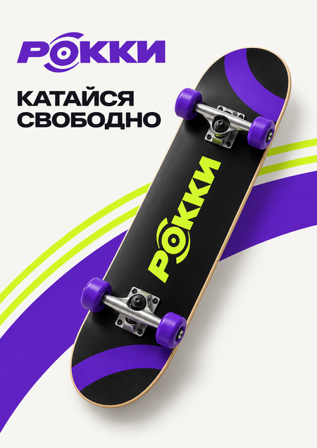
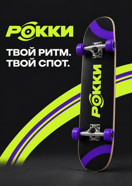
Постеры
Пространство
Следующим этапом стала визуализация магазина, зоны катания, мест отдыха и навигации. Фирменные цвета и дуги были перенесены в интерьер, дополнены бетоном, светлой фанерой и угольным металлом.
Кейвизы
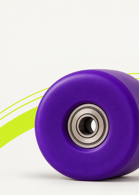
Для кампании были созданы кейвизы с изменённым масштабом предметов: огромное колесо скейтборда стало центральным образом, а скейтборд и фигура человека добавили контраст и динамику.