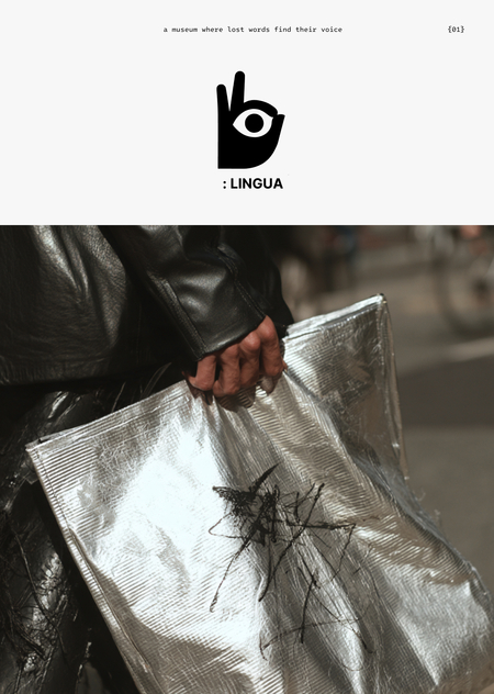
Lingua Amissio — это музей, где утраченные слова обретают голос не для того, чтобы их просто услышали, а для того, чтобы их почувствовали, впустив в самое сердце
Здесь язык — это не система знаков, а живая сущность, наделенная собственной душой. Каждый исчезнувший диалект, каждое наречие, на котором произнесли последнюю молитву — это не просто страница в учебнике лингвистики
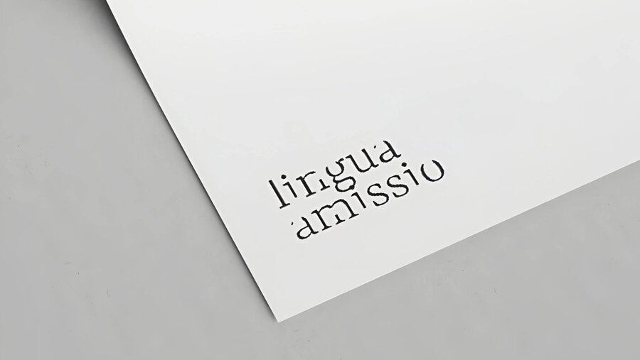
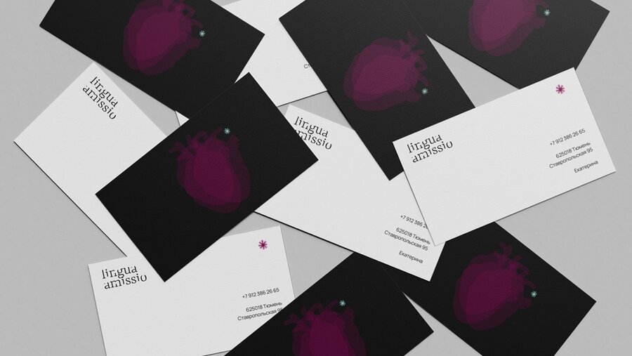
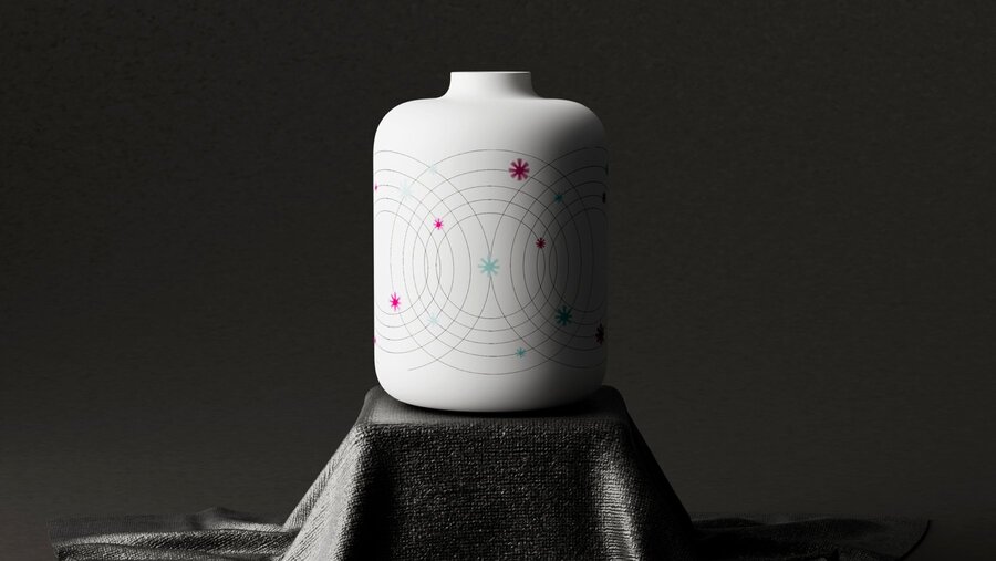
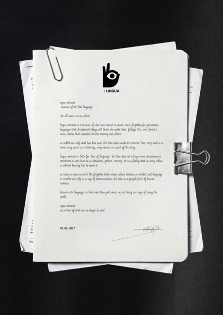
Редизайн Lingua Amissio включает в себя идею взгляда, который видит исчезнувшее. Само название было сокращено до LINGUA (шрифт Konkhmer Sleokchher).
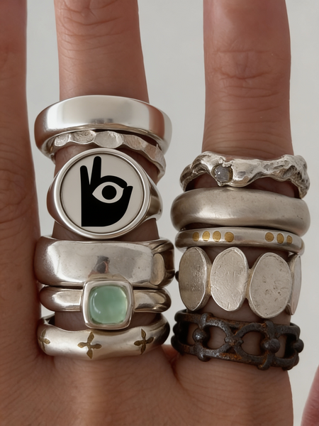
Сам промт был написан вручную, генерация через мудборды в Midjourney. Логотип был взят с генерации иконки.
Логотип был взят с генерации иконки.
generate a monochrome palette
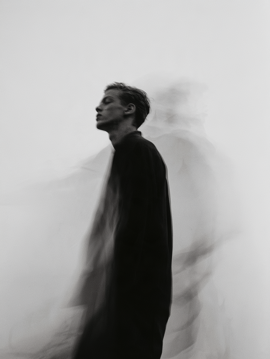
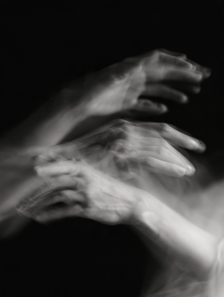
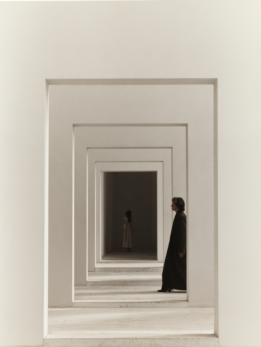
A minimalist and symmetrical composition that shows a series of light gray concentric square frames, creating a tunnel effect or infinite perspective. In the middle shot, a woman dressed in a dark coat walks to the right, while in the deeper shot, another female figure with her back turned is observed through the openings. The lighting is soft and uniform, emphasizing the clean geometric lines and architectural depth of the space.Black and white artistic photograph featuring a long-exposure, motion-blur effect of human hands. The composition focuses on the hands intertwined and moving, creating multiple overlapping, translucent silhouettes that suggest fluid, graceful motion. The lighting is soft and directional, highlighting the texture of the skin against a solid, deep black background. The overall aesthetic is ethereal, minimalist, and moody, emphasizing the rhythm and gesture of the hands.A black and white, full-body portrait of a person standing in profile against a plain, light-colored wall. The subject is dressed in dark, minimalist clothing. The image features a deliberate motion blur effect, creating multiple ghostly, semi-transparent silhouettes that trail behind the subject, suggesting movement or a sense of temporal displacement. The lighting is soft and diffused, emphasizing the grainy, artistic texture of the photograph. The composition is centered, focusing on the contrast between the sharp, static figure and the blurred, ethereal motion trails.
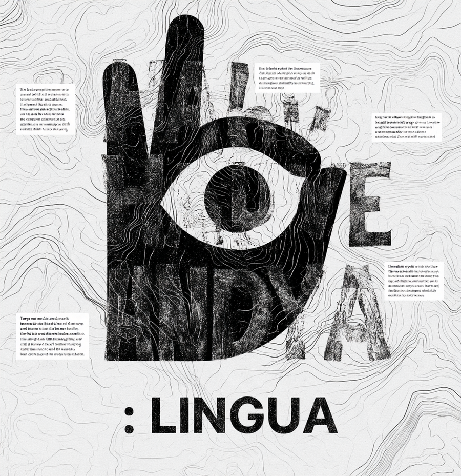
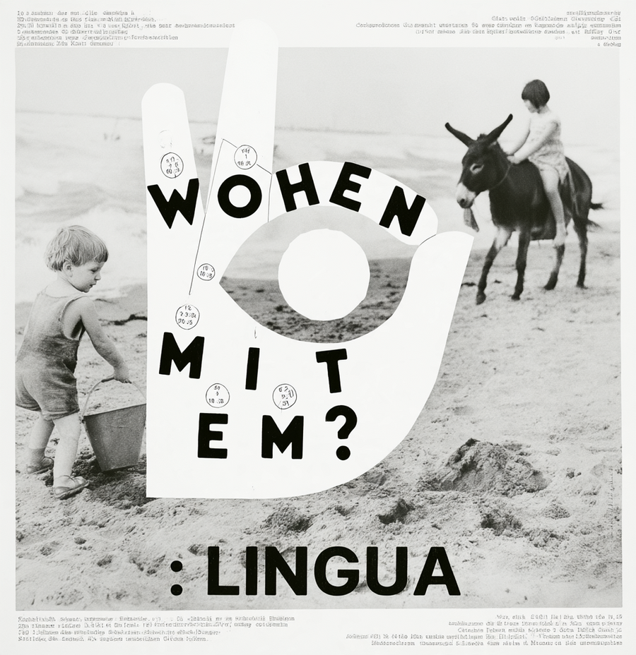
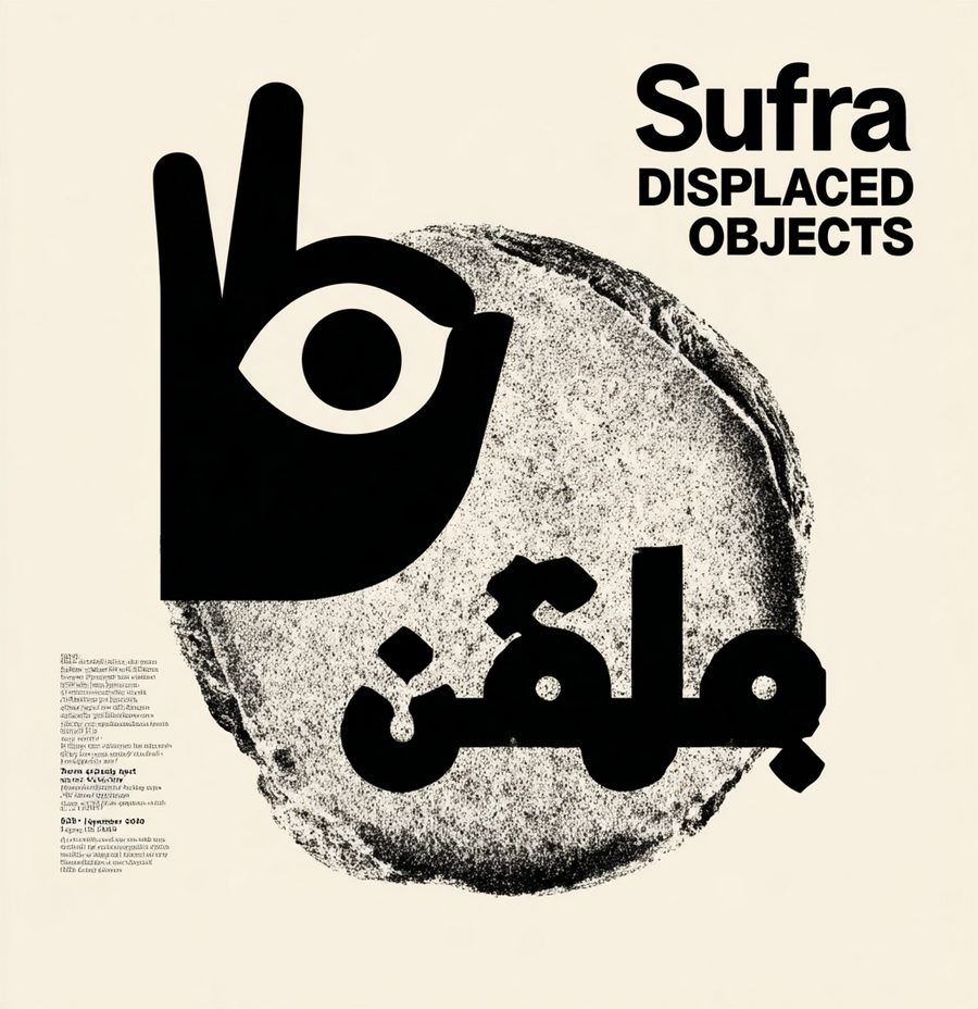
A vertical graphic design poster featuring a textured, light gray background overlaid with thin, dark gray contour lines resembling a topographical map. Large, bold, distressed black typography is integrated into the composition, partially obscured or shaped by the contour lines. Scattered throughout the negative space are smaller, clean sans-serif text blocks containing poetic phrases and observations. The overall aesthetic is minimalist, intellectual, and editorial, utilizing a monochromatic palette with a focus on the interplay between organic map-like shapes and structured, heavy-weight lettering.A minimalist exhibition poster design with a cream-colored background. The central element is a high-contrast, black-and-white grainy circular graphic resembling a textured stone or a celestial body with rough, eroded edges. The typography is bold, black, and sans-serif, positioned in the upper right quadrant reading «Sufra DISPLACED OBJECTS». On the left side, smaller, left-aligned text provides event details including location, dates, and organizers. At the bottom, a large, stylized Arabic script is overlaid across the lower portion of the circular graphic, maintaining the same black ink aesthetic. The overall composition is clean, modern, and editorial, utilizing negative space and a stark monochromatic palette.A minimalist graphic design poster with a black and white collage aesthetic. The composition is based on a vintage style stock photograph showing a small child playing on a beach with a bucket and another child riding a donkey in the background. The image is fragmented by a white and angular geometric shape, similar to a star or a broken glass, which is superimposed on the photograph. Inside this white shape, black letters are distributed that form the word «WOHEN MIT EM?» along with event dates and times. The design uses a Moderna and clean sans-serif typography, with small numbers enclosed in circles above each letter. The additional informative text is aligned in the upper and lower margins, maintaining a clean and structured Swiss typographic style.
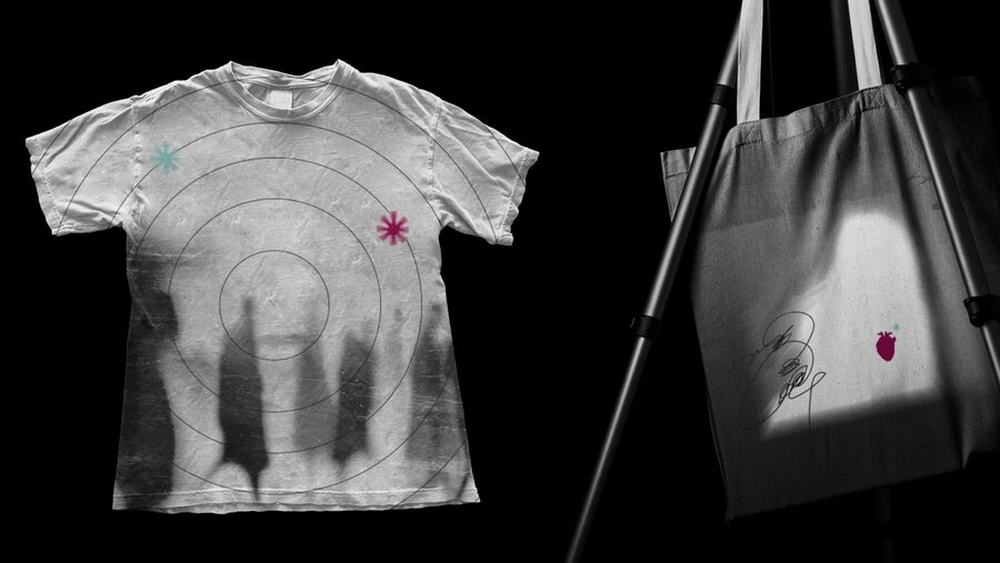
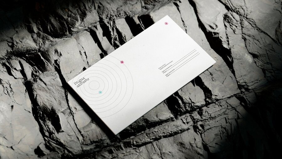
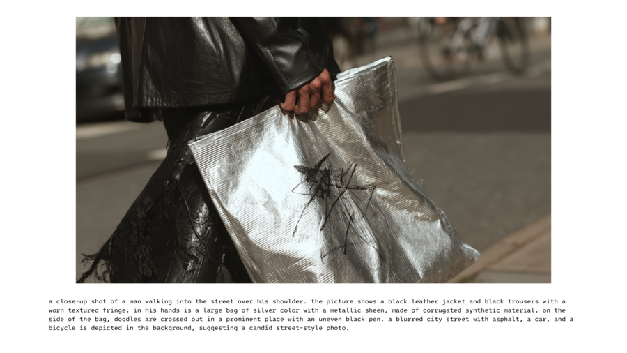
В айдентику бренда вошли округлые и рваные формы, а так же небрежный рисунок черной ручки.
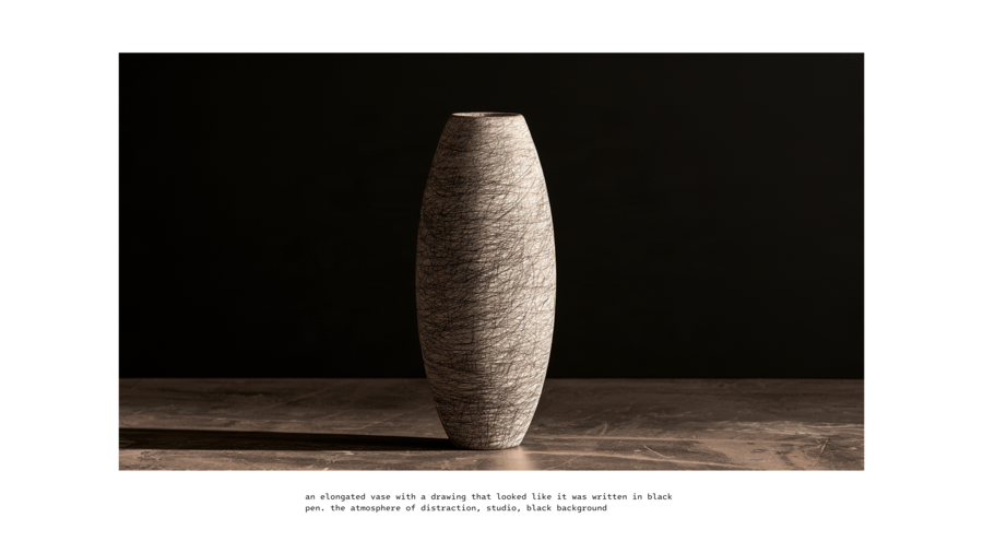
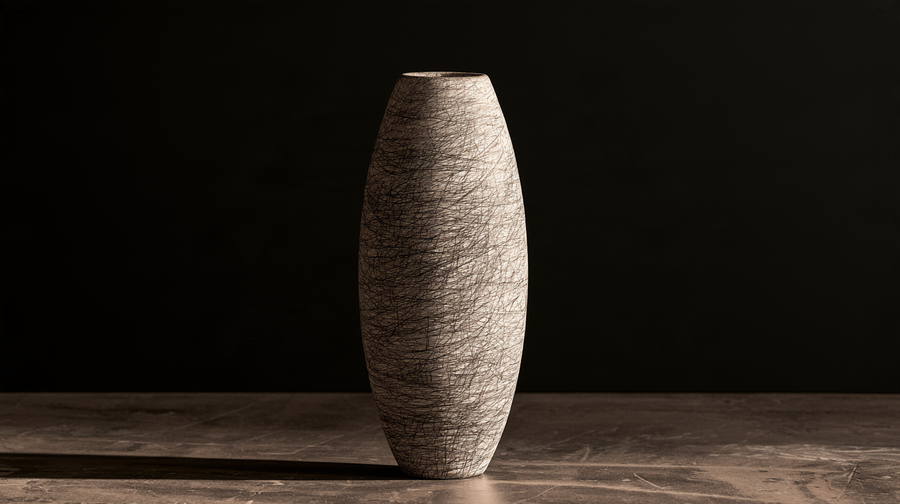

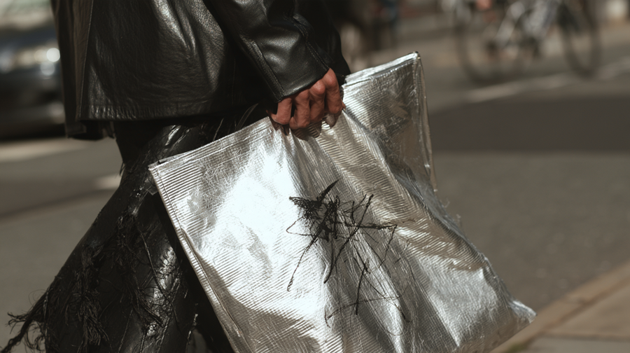
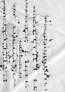
Визуальный код Lingua строится на эстетике утраты, повреждения и фрагментации. Это язык несовершенных поверхностей, нарушенных контуров и форм, которые будто утратили свою первоначальную целостность.
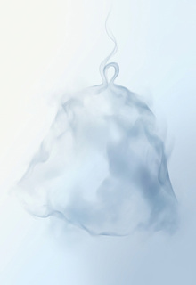
Неровное серебро становится метафорой памяти — холодной, отражающей, искажённой временем. Его поверхность напоминает смятый архивный документ, металлический осколок или след прикосновения к чему-то давно исчезнувшему.
Перечеркнутые формы символизируют невозможность полного прочтения и утрату смысла. Зачёркивание здесь не уничтожает объект, а фиксирует момент его исчезновения. Форма остаётся видимой, но её значение становится недоступным.
Рваные контуры передают разрыв между присутствием и отсутствием. Они нарушают привычную геометрию, создавая ощущение фрагмента, извлечённого из неизвестного целого.
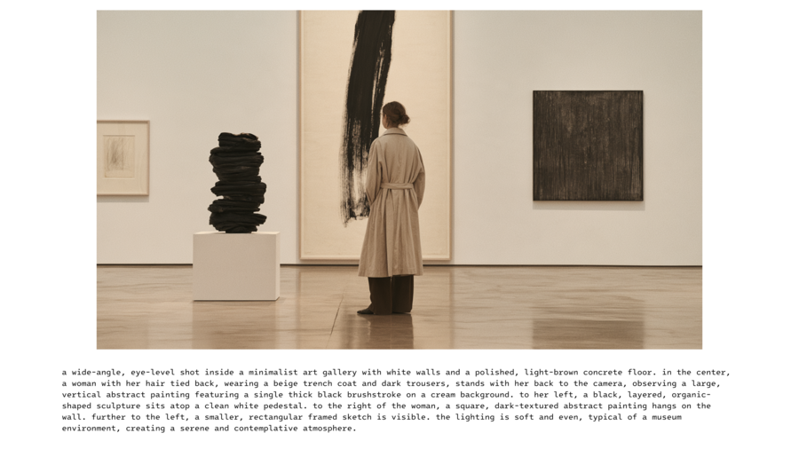
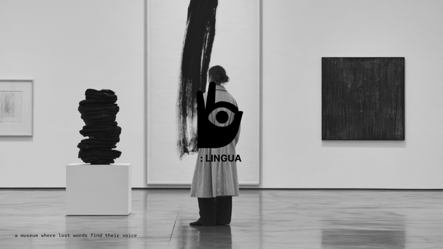
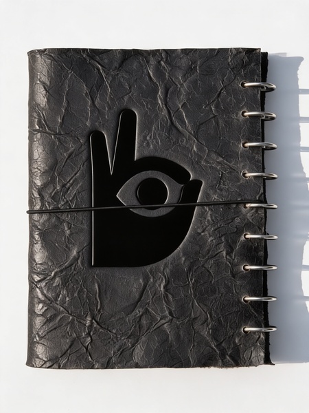
Вместе эти элементы формируют визуальный язык, в котором несовершенство становится способом сохранения памяти, а повреждение — самостоятельной формой высказывания.
Использовались модели Midjourney, Magnefic (Seedream 4.5)