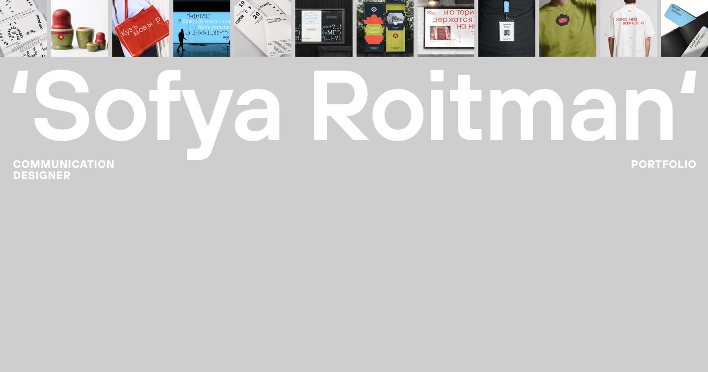
I’m Sofya Roitman. I’m a communication designer who works primarily with brand identity.
In every project, I try to find a starting point that will help shape the entire visual identity: this could be the history of a place, a unique feature of a material, the structure of language, or the nature of the project itself.I enjoy exploring the context, looking for unexpected connections, and testing how the ideas I discover work in graphic design. The result is a system in which typography, color, composition, and individual elements are linked by a common logic.In this portfolio, I’ve compiled projects in which this approach has manifested itself in various ways.I’m curious about how an idea becomes a graphic design
How do I approach projects?
Research. I study the project, its history, unique features, and target audience. I look for details that can serve as the foundation for the concept. ↓ Concept. I formulate the main idea and determine how it can be expressed visually. ↓ Development. I work with typography, graphic elements, color, and composition. I test how they work together and what possibilities they offer. ↓ Implementation. I assemble the elements into a system and see how it works across different media.It’s important for me to understand why a visual solution is structured the way it is. This helps maintain a connection between the initial idea and the final design.
Hotel branding
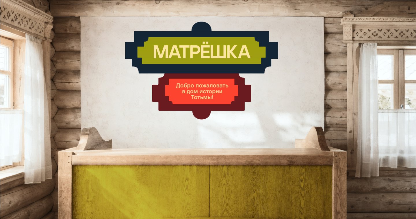
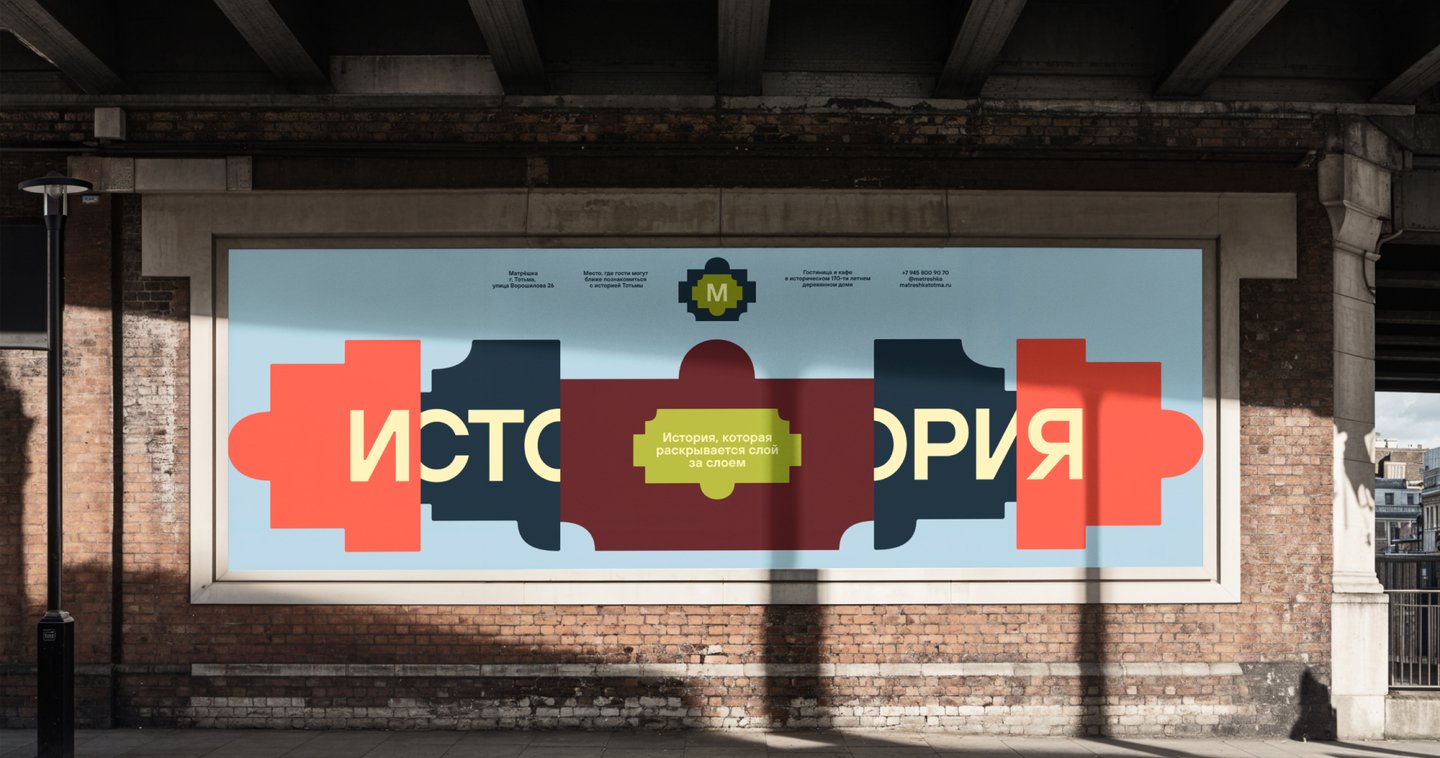
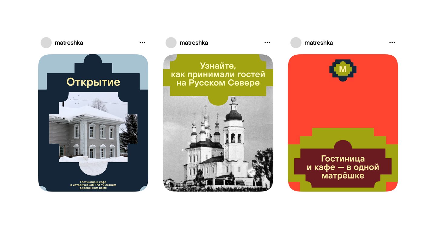
[1] Matryoshka
Problem: How can the hotel’s rich history be expressed through a contemporary visual identity? Located in a 19th-century wooden house in Totma, Matryoshka draws on the city’s merchant heritage and its connection to Russian America.Concept: Inspired by the matryoshka doll and its layers, I combined local ornaments and architectural details into a graphic system built on nesting, layering, and gradual discovery.Result: A distinctive visual identity that connects the hotel’s name with Totma’s architectural heritage, translating the character of the place into a cohesive graphic language.
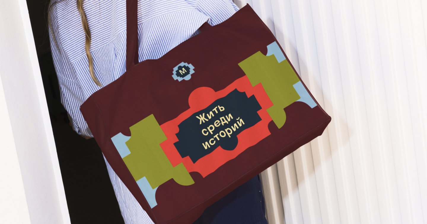
Museum branding
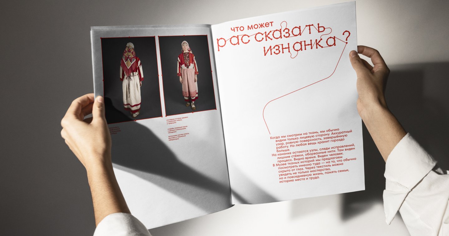
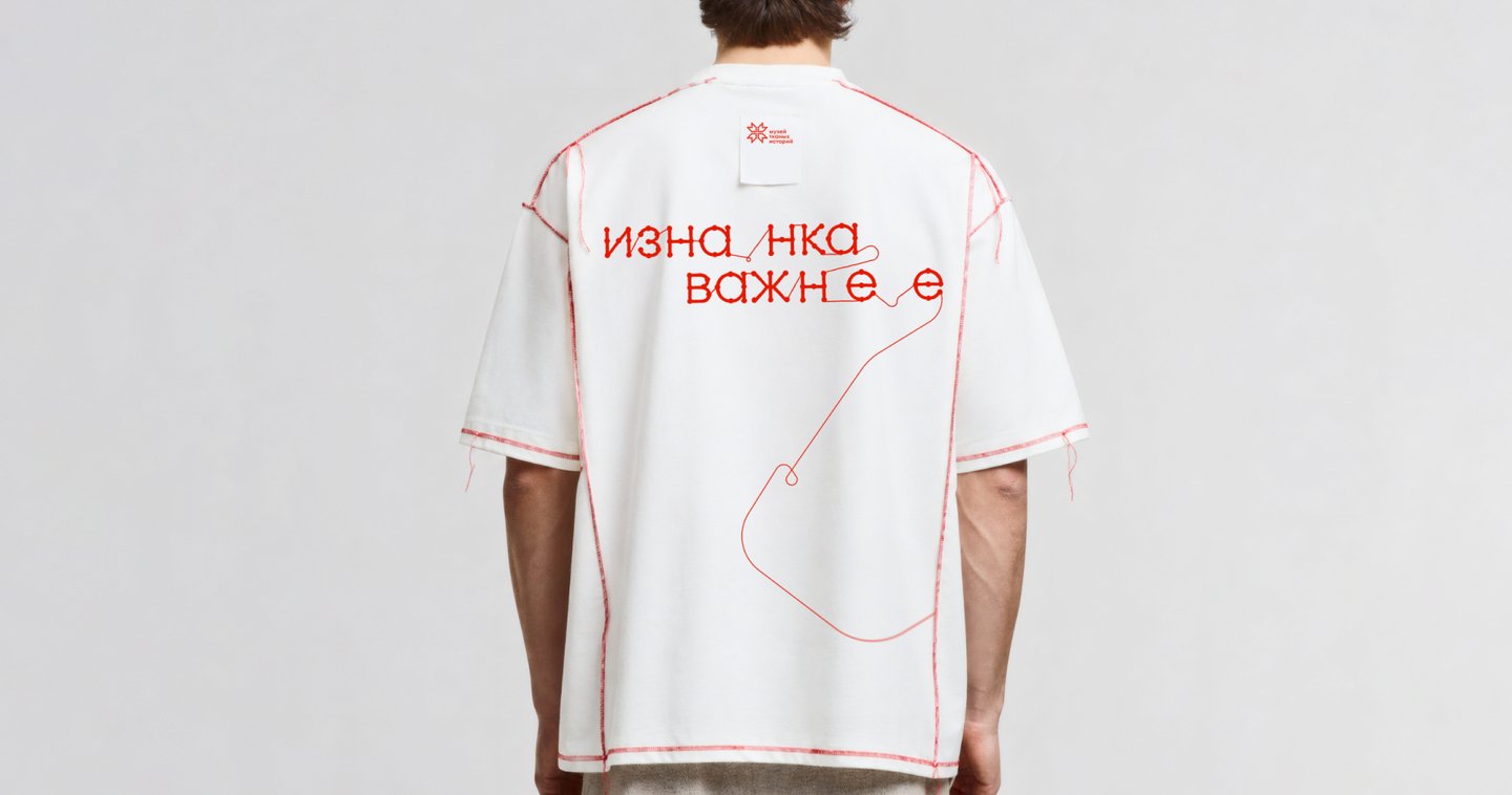
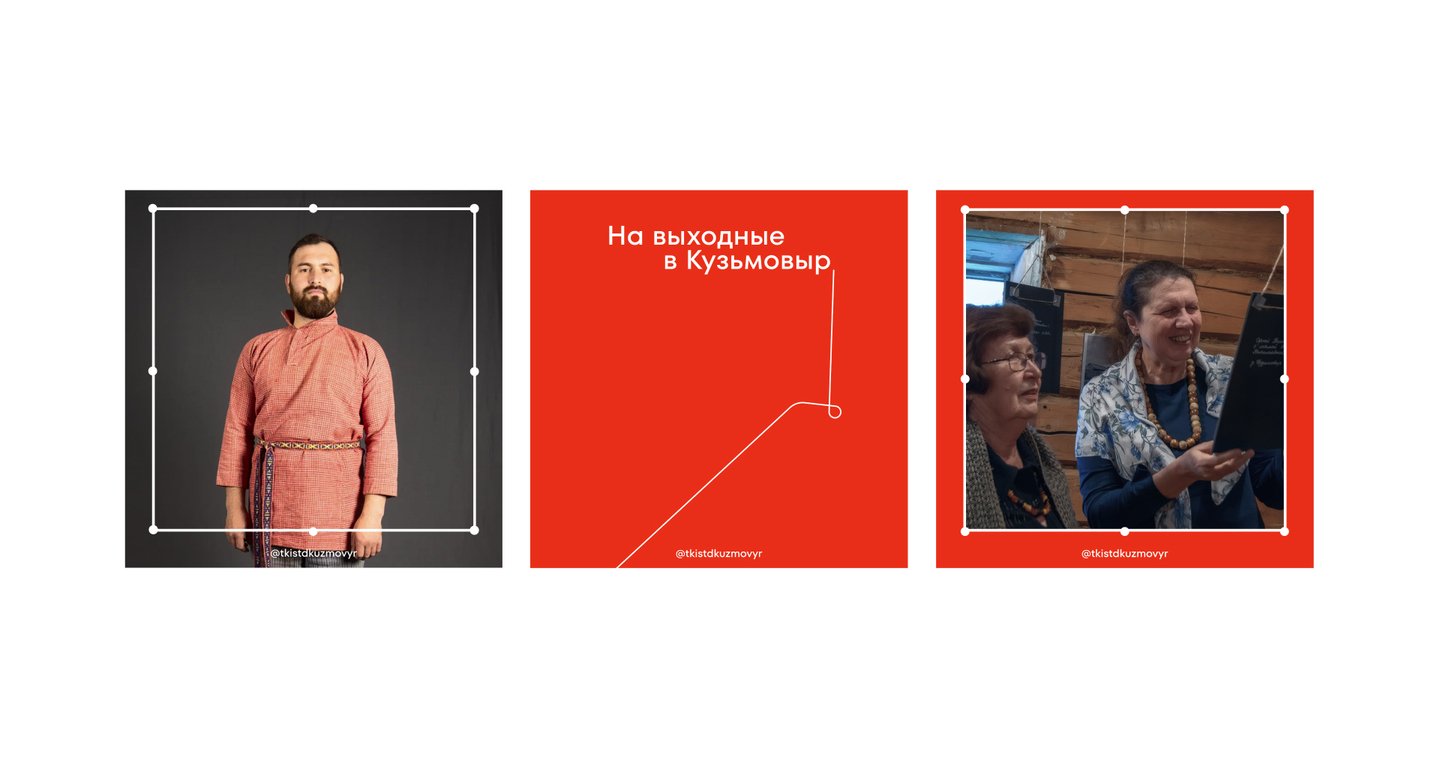
[2] Museum of Woven Stories
Problem: How can the museum communicate the heritage of weaving in Kuzmovyr, northern Udmurtia, while highlighting the skills and knowledge behind each piece?Concept: Inspired by the two sides of fabric, I explored the contrast between the finished textile and the process behind it. The «reverse side» became a metaphor for revealing the hidden work behind the craft.Result: A visual concept rooted in the structure of weaving, connecting the museum’s identity with the material, process, and knowledge behind this traditional craft.
Festival branding
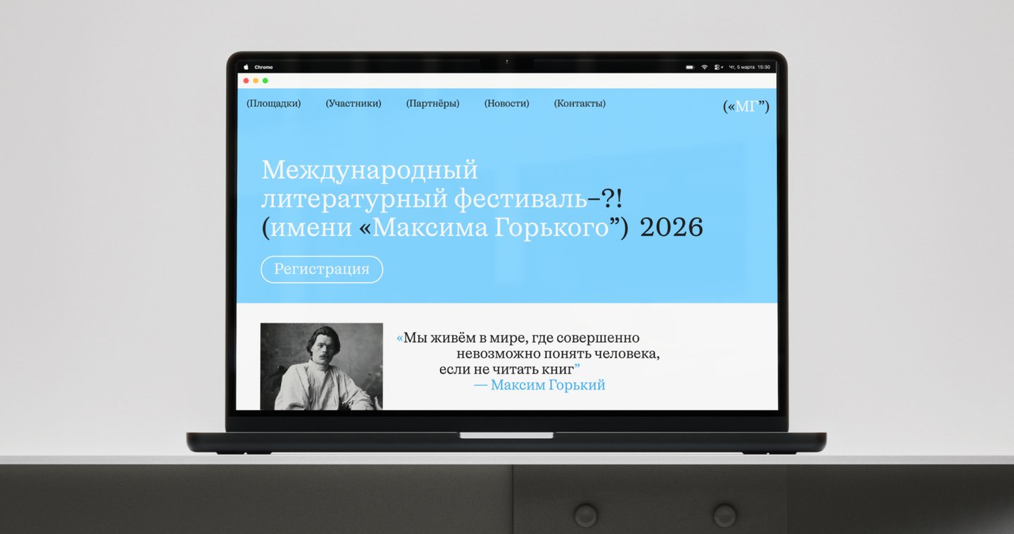
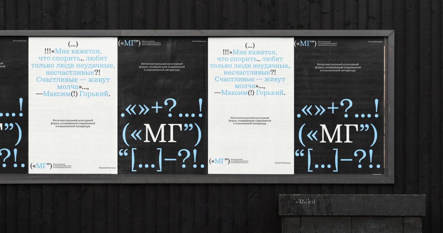
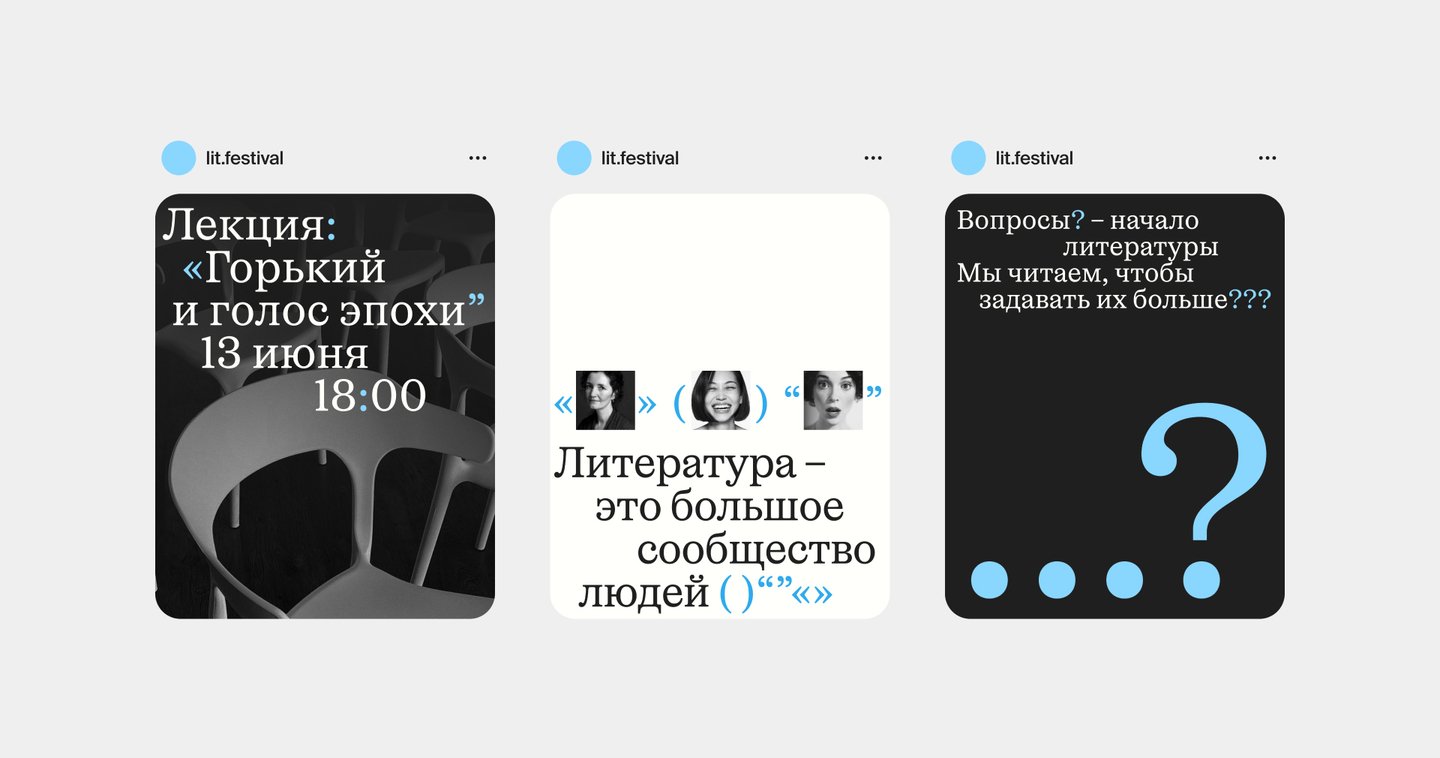
[3] Maxim Gorky International Literary Festival
Problem: How can the festival’s intellectual character and diversity of ideas be expressed through a flexible graphic identity?Concept: I chose punctuation marks as the foundation of the visual system. Each mark carries its own meaning and intonation, while their combinations create new visual compositions, echoing the way language conveys ideas.Result: A flexible graphic identity built around punctuation, turning familiar typographic elements into expressive compositions for the literary festival.
Calendar design
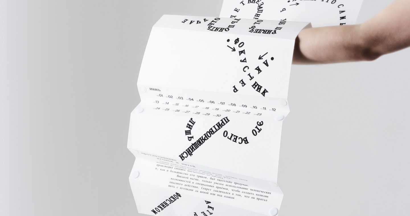
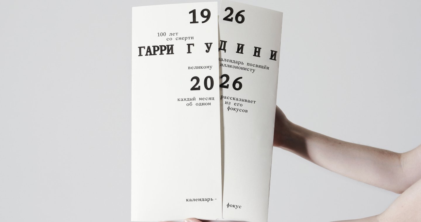
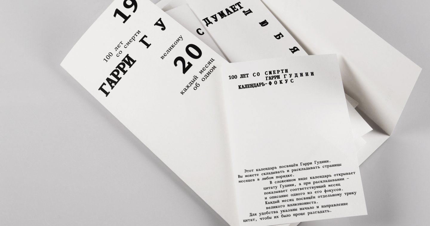
[4] Harry Houdini Focus Calendar
Problem: How can a calendar commemorate the 100th anniversary of Harry Houdini’s death while capturing the mystery and movement of his famous escapes?Concept: Each month explores one of Houdini’s tricks, with illustrations concealing coded quotes. The foldable structure creates layers and overlaps, inviting viewers to interact with the calendar and gradually reveal the hidden messages. Shifting typography and altered kerning evoke movement and the feeling of escape.Result: An interactive calendar that turns Houdini’s legacy into a visual puzzle, combining storytelling, typography, and paper mechanics into a playful experience.