Communication Theory: REART
How does communication theory work in design?
At first, it might seem that design is about appearance: icons, colors, interfaces, logos, branding, and beautiful posters. But in reality, anything created by humans somehow speaks to us. Even when clicking the «Save» button in a file, a person receives the response «Changes saved,» which is also a kind of communication act. It’s just that instead of words, form, action flow, and system response are at work here.
If we adhere to precisely this point of view, then design transforms from a simple art of arranging objects and colors into building a dialogue between the designer (the company) and the consumer. And this dialogue also has its own laws and mechanics, just like any other conversation.
Not Just Beautiful, But Meaningful
Let’s imagine that a product is a message. The company (sender) is telling the consumer (receiver) something through the interface (channel). And, as in any conversation, misunderstandings are possible here. The user couldn’t find the needed function, which became extra «noise.» They angrily close the website, and «negative feedback» appears. The designer’s task is to ensure the message is heard accurately and the dialogue is productive and pleasant.
But what makes a dialogue pleasant and productive? More specific, yet important, communication theories answer this question.
1. Design as a Mutually Beneficial Exchange (Social Exchange Theory)
At the core of almost any human interaction lies a question, simple and not always conscious: «What’s in it for me?» People unconsciously begin to weigh their costs, such as time, effort, and money, against rewards, for example, some kind of utility, pleasure, or status.
What does this mean for design? It’s simple: value must be obvious, and the path to it must be short. — One-click purchase as the anthem of this theory. Minimum effort — maximum result. — A free trial period is a way to let people feel the «reward» without immediately demanding «costs.» — If you make a user go through ten screens with forms for a simple task, they will feel they’ve entered into an unfavorable deal and will simply leave.
2. Design as the Embodiment of Justice (Equity Theory)
People are very social creatures. They don’t just want to gain a benefit; they want that benefit to be fair compared to everyone else. A classic experiment with temporary workers who were paid differently for the same work showed: if a person knows a colleague is being paid more, they start slacking off. Conversely, the one who is overpaid may start overworking to «justify» their income.
What does this mean for design? Product must be perceived as an honest partner. — Rating systems in various services (e.g., Yandex Go) are a mechanism that makes dishonest behavior disadvantageous for all participants. Justice is at work here. — Transparent monetization. If you give paying users real advantages, not just remove limitations, it’s fair. If not, a sense of deception arises. — Interestingly, research shows that our sense of justice is heightened if we are treated unfairly by someone we dislike. Social context matters greatly.
3. Design as a Manifestation of Respect (Politeness Theory)
Each of us has a «public face» — a need to appear competent and maintain autonomy. A rude error, a peremptory demand, an intrusive interface — all of these are «threats» to our «face.» Politeness theory studies exactly how to soften these threats.
What does this mean for design? Design must be tactful. — Compare: «ERROR! You did everything wrong!» and «Something went wrong. Let’s try again?» The second phrase does not accuse but offers a helping hand, unlike the first. — The ability to easily unsubscribe from a mailing list, cancel an action, or complete registration later is not just functionality; it’s respect for the user’s freedom and personal space. — Even a simple phrase like «Save changes» instead of the impersonal «Accept» makes the dialogue more human.
4. Design That Unites (Social Interdependence Theory)
This theory explains how the very structure of goals determines our relationships. If goals are shared (positive interdependence), then people help each other. If goals contradict each other (negative interdependence), then people compete with one another.
What does this mean for design? We can consciously design environments for cooperation or healthy competition. — Figma, Google Docs — these are brilliant examples of positive interdependence. The project’s success becomes shared, and the design encourages mutual assistance: commenting, collaborative editing. — Game leaderboards, where you can only be first, create negative interdependence, motivating through the thrill of competition. — Research shows that for cooperation to succeed, it’s not enough to just drop people into a common chat. It’s necessary to ensure individual accountability (so that everyone contributes and no one «free rides») and provide space for group reflection («how can we improve our joint work?»). These are direct guidelines for designing features.
Conclusion
So, where is the designer’s place in all this? They become not the one who «draws buttons,» but the architect of human interactions.
They use social exchange as a compass to build a path beneficial for the user. They are guided by justice as a conscience to create fair systems. They apply politeness as grammar to communicate respectfully and tactfully. And finally, they use interdependence as a constructor to assemble environments where people want and are able to help each other.
In the end, even the most beautiful and advanced design is worthless if it’s not backed by a correctly structured message, aligned with communication theories, helping people negotiate, help each other, trust, and feel valued. Today, design is the language with which the designer speaks to the consumer not only about functionality but also about trust, justice, respect, and mutual assistance. And it’s definitely a language that needs to be learned.
REART — Wide Audience Presentation
Why REART Exists: A Story You Instantly Recognize
Every day we are surrounded by objects we don’t notice anymore — chairs, bags, street banners, surfaces we touch, colors we pass by. We rarely ask ourselves how these things are made, or what happens to them once they’re gone. REART was created to change that feeling.
Not through lectures or heavy ecological guilt — but through beauty, curiosity, and a sense of rediscovery.
In communication theory this is called framing: we shift attention away from fear and obligation, and towards inspiration.
We don’t say: «You must recycle.» We say: «Look how exciting reuse can be.»
This is the emotional entry point — the peripheral route of persuasion — where a person first feels something, and only then begins to think.
What Makes REART Visually Attractive
When you see REART, the first thing you notice is the visual rhythm: bold shapes, layered textures, uplifting colors. These patterns come from the real process of recycled plastic being melted, pressed, and reborn.
But for the general audience, the message is simpler: REART looks good — and it makes you feel good.
This is precisely where storytelling works. A good story doesn’t overwhelm with explanations; it creates a small emotional hook.
And REART’s hook is transformation: fragment → pattern waste → beauty material → emotion
People intuitively love that narrative because it mirrors their own desire to renew, refresh, update themselves and their spaces.
Why It Matters to Your Daily Life
We often think that sustainability is something distant — something for activists, brands, or governments. But in reality, it starts with the objects we choose.
REART brings recycled materials into everyday life not as a compromise, but as a style. A mood. A way to make your environment feel more expressive and meaningful.
In communication theory this is called mentalization: before speaking, we imagine what the audience cares about. And the truth is, most people don’t want to «save the planet today.» They want something that: — looks modern, — feels personal, — and doesn’t require extra effort.
That is why REART focuses on emotional benefit, not technical complexity. It tells you: «Upgrade your space. Upgrade your mood. The planet will thank you later.»
How REART Appears in the City
In public spaces — on posters, bags, billboards — REART functions as a visual spark. It catches your eye before you even read the name.
This is where agenda setting works: We don’t tell people what to think, we show them what is worth noticing.
When people repeatedly encounter these bright patterns, recycled plastic stops being a «hidden material» and becomes something stylish and familiar. The city becomes a gallery of possibilities, not a background you ignore.
REART as an Experience, Not Just a Product
REART also lives in physical installations — small interior fragments built from recycled components. Why is this important for a broad audience?
Because people trust their senses more than words.
Touch, color, texture — these persuade through the peripheral route, which is how most everyday decisions are made.
When someone steps into a REART space, they don’t think: «Oh, interesting material circularity logic.»
They think: «Wow, I didn’t expect recycled plastic to feel like this.»
And that moment of surprise is much stronger than any rational argument.
REART’s Promise to the Audience
Our slogan — «Reform your space, your style, your design» — is not an instruction. It’s an invitation. A small push to rethink the things you surround yourself with.
REART suggests that creativity and care for the environment can be the same gesture. You choose something beautiful. You contribute to something meaningful. You feel part of a cultural shift without even trying.
This is where storytelling meets values — the core of persuasive communication theory.
Final Message: Why You Need REART
If I could summarize REART for a general audience, I would say this:
It makes your daily life more expressive. It helps you see beauty where you didn’t expect it. And it turns an ordinary material into a personal aesthetic experience.
Not because you «should,» but because it feels good. And when something feels good, the message is received even before it is understood — exactly as communication theory teaches us.
REART — Professional Audience Presentation
REART — a conceptual design brand and an exhibition project exploring how recycled plastics can shape new forms of contemporary interior environments. REART is positioned at the intersection of sustainable material research, graphic identity, and spatial communication. Rather than treating ecological design as a purely functional task, REART considers it a cultural practice that is inseparable from aesthetics, education, and public engagement.
What distinguishes the project is its ambition to demonstrate that sustainability does not have to compromise visual richness or emotional resonance. On the contrary, recycled materials can become the drivers of a new visual language — expressive, modular, bold — and capable of reforming how we perceive interior space.
Conceptual framework: recycled plastic as a new aesthetic
The starting point of the brand is a simple but powerful question: What happens when recycled plastic stops hiding in infrastructure and becomes a central, celebrated component of interior design?
This shift requires not only technical innovation but also a deep reframing of cultural perception. In contemporary design discourse, recycled materials often remain associated with compromise — a cheaper or «secondary» option. REART challenges this assumption by making recycled plastic the aesthetic protagonist.
The brand identity supports this conceptual ambition. The two key patterns—one geometric, referencing the stratified texture of processed plastics, and another typographic, constructed from modular letterforms—create a visual metaphor of transformation. They show how diverse material fragments can be reassembled into coherent, expressive structures.
This approach positions recycled plastic not as a distant ethical gesture, but as a material with its own visual culture, worthy of exploration and design refinement.
The visual system: how identity supports the material theme
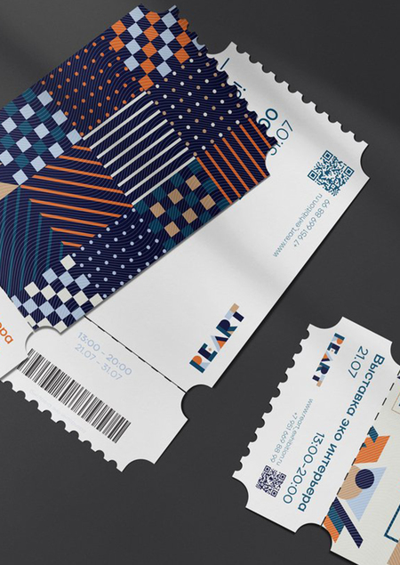
The graphic system of REART is intentionally modular and rhythmic. It mirrors the way recycled plastic sheets, panels, and tiles are typically produced — through processes of cutting, layering, compressing, and reassembling. Color is also crucial: the palette of deep navy, terracotta orange, muted beige, and pale blue reflects a mixture of natural and industrial references. This duality anchors the project between ecology and contemporary urbanity.
For a professional audience, this visual strategy communicates two key messages: Material logic determines visual logic. The brand identity does not decorate — it interprets the recycled material’s inherent properties.
Modularity is not only a design technique but an ethical stance: it reflects circularity, adaptability, and low-waste production.
Public-Facing Applications: brand expansion into the urban environment
The presence of REART in public space — posters, billboards, transport graphics, and wearable items — serves as an important communication layer.
These applications demonstrate how the identity system remains flexible while retaining conceptual coherence. The city becomes the first testing site for the brand’s message: reforming your space can begin with rethinking the materials that shape your everyday surroundings. In a professional context, these visuals show the scalability of the system and its ability to adapt across media without losing narrative intention.
Expositional practice: space as a communication tool
Although the images here show the identity rather than the interior installation itself, the entire visual system is conceived to be carried into three-dimensional space. REART proposes an exhibition format where recycled plastic components form modular interior fragments, scenographic structures, and tactile surfaces.
The goal is to create an immersive, dialogic environment that allows visitors — including designers, architects, and curators — to encounter recycled materials at both sensory and conceptual levels. The exhibition becomes a research platform rather than a static display. Visitors can explore modules, observe material transitions, and interact with textures that usually remain invisible in everyday objects. This aligns REART with current practices in critical and speculative design, where the exhibition becomes a method for thinking materially about the future, rather than merely presenting completed artefacts.
The brand as an educational and cultural initiative
REART positions itself not only as a brand but as a space for exchange, discussion, and learning. The exhibition prioritizes public education on material cycles, ecological responsibility, and the aesthetics of reuse.
This commitment is embedded in the brand’s communication slogan: «Reform your space, your style, your design.»
For professionals, this line highlights that REART is not a decorative style but a strategic position in material culture. It encourages designers to reconsider their dependencies on virgin materials and to participate in building new ethical aesthetics.
The logo and its structure
The REART logo is built from geometric fragments that subtly reference the diversity of recycled materials and the way they interact. The visual fragmentation is not a stylistic effect —
it is a conceptual device. It shows how disparate elements can form a stable whole through thoughtful design. For professionals familiar with branding, this signals a deep alignment between conceptual narrative and graphic execution.
Professional Relevance: Why REART is important for designers and curators
REART has resonance for several fields: — Interior designers gain a new aesthetic and constructive vocabulary for recycled plastics. — Exhibition designers see how modularity and sustainability can generate scenographic expressiveness. — Branding and communication specialists observe how material logic can drive identity systems. — Cultural institutions receive a format that merges ecological education with contemporary design discourse.
In a broader professional landscape, REART demonstrates an integrated approach where ecology, aesthetics, and communication are not separate domains but mutually reinforcing layers.
Conclusion
To conclude, REART is an invitation to rethink not only materials but also the ways we communicate and exhibit sustainable design. It proposes a new, vibrant aesthetic for recycled plastic and builds a brand identity grounded in modularity, texture, and cultural narrative.
Ultimately, the project argues that sustainability becomes truly persuasive only when it is both ethically grounded and aesthetically compelling — a principle that REART embodies through its visuals, its messaging, and its commitment to transforming public perceptions.
How the online course helped us?
The course materials became a valuable theoretical foundation that allowed us to rethink the role of design and structure communication. The conceptual toolkit of the course was particularly useful for two key aspects: for a deep understanding of design as a socially driven communication practice, rather than just aesthetics, and for system design and brand presentation, which requires different strategies for a wide and professional audience. The course showed that communication theory is a meta—tool that helps to consciously build and analyze all brand messages.
1. Design as Purposeful Communication, Not Just Form. Theory provides not abstract knowledge, but concrete analytical lenses (rhetoric, semiotics, critical theory). For example, a functional element is not just a button; it is a persuasive statement (rhetoric), a sign (semiotics), and a reflection of ideology (critical tradition). This allows a shift from intuitive decisions to testable hypotheses about the audience.
2. Relationships, Not Broadcast. Theories of politeness, social exchange, and equity demonstrate that a brand does not broadcast but builds a long-term dialogue. Every design element, from the tone of an error message to a service’s structure, impacts the user’s «face» and the perceived fairness of the exchange. This determines everything, from copywriting to the monetization model, ensuring the user does not feel cheated or disrespected.
3. Persuasion Strategies for Different Contexts. A crucial distinction is the approach to different audiences, as clearly described by the Elaboration Likelihood Model (ELM).
— For a general audience with low involvement, narratives, emotions, visual patterns, and simple claims are effective. — For a professional audience with high involvement, central arguments are critical: data, methodology, and conceptual rigor.
4. Reflection and Responsibility. Critical theory adds a vital ethical layer, warning against turning significant themes (sustainability, inclusion) into empty marketing trends. It calls for creating design that opens space for dialogue and rethinking norms, rather than merely exploiting social issues.
5. Integration into the Digital Environment. Dialogic communication theory shows that a digital channel (social media) is meaningless by itself. It’s essential to design feedback loops, responsiveness, and modular content to transform a monologue into an interactive exchange.
The course provides more than a set of theories; it builds a systemic mindset. It allows one to see in design not form, but a communicative act; not intuition, but a strategy based on understanding the audience; and not neutral aesthetics, but a socially responsible practice. Ultimately, this provides the language and methodology to justify decisions and build a more precise, effective, and respectful dialogue through design.
Sources
Communication Theory: Bridging Academia and Practice // edu.hse.ru (Accessed: 20.11.2025).
Elaboration-Likelihood Model (overview) // SimplyPsychology.org URL: https://www.simplypsychology.org/elaboration-likelihood-model.html (Accessed: 01.12.2025).
YouTube video: Elaboration Likelihood Model explained // YouTube.com URL: https://youtu.be/cwq4NXrOYw0?si=F5CAaWm-oaL6tW1p (Accessed: 02.12.2025).
Persuasion in Crowdfunding: An Elaboration Likelihood Model of Crowdfunding Performance // ResearchGate.net URL: https://www.researchgate.net/publication/320768185_Persuasion_in_crowdfunding_An_elaboration_likelihood_model_of_crowdfunding_performance (Accessed: 02.12.2025).
Elaboration Likelihood Model // Wikipedia.org URL: https://en.wikipedia.org/wiki/Elaboration_likelihood_model (Accessed: 02.12.2025).
Goffman, Face and the Interaction Order // ResearchGate.net URL: https://www.researchgate.net/publication/373210851_Goffman_face_and_the_interaction_order (Accessed: 02.12.2025).
Project REART // Author: Sofia Sholokh // portfolio.hse.ru URL: https://portfolio.hse.ru/Project/214386 (Accessed: 01.12.2025).
Project REART // Author: Sofia Sholokh // portfolio.hse.ru URL: https://portfolio.hse.ru/Project/214386 (Accessed: 01.12.2025).


