TRASH. Jewelry

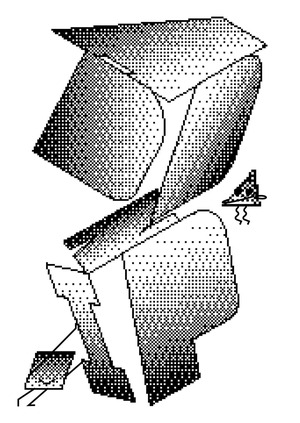
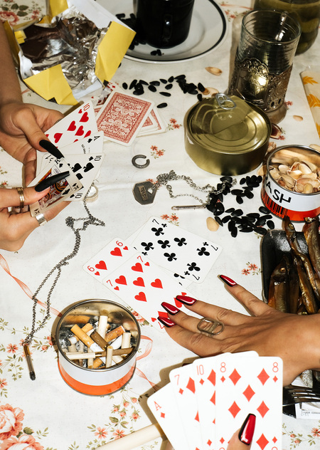
They didn’t find themselves in the dumpster. Trash is a silver ornament inspired by garbage. The concept of brand is to rethink garbage. Ideas for decorations are taken from forms of ordinary household items that were looked at from a non-standard angle.
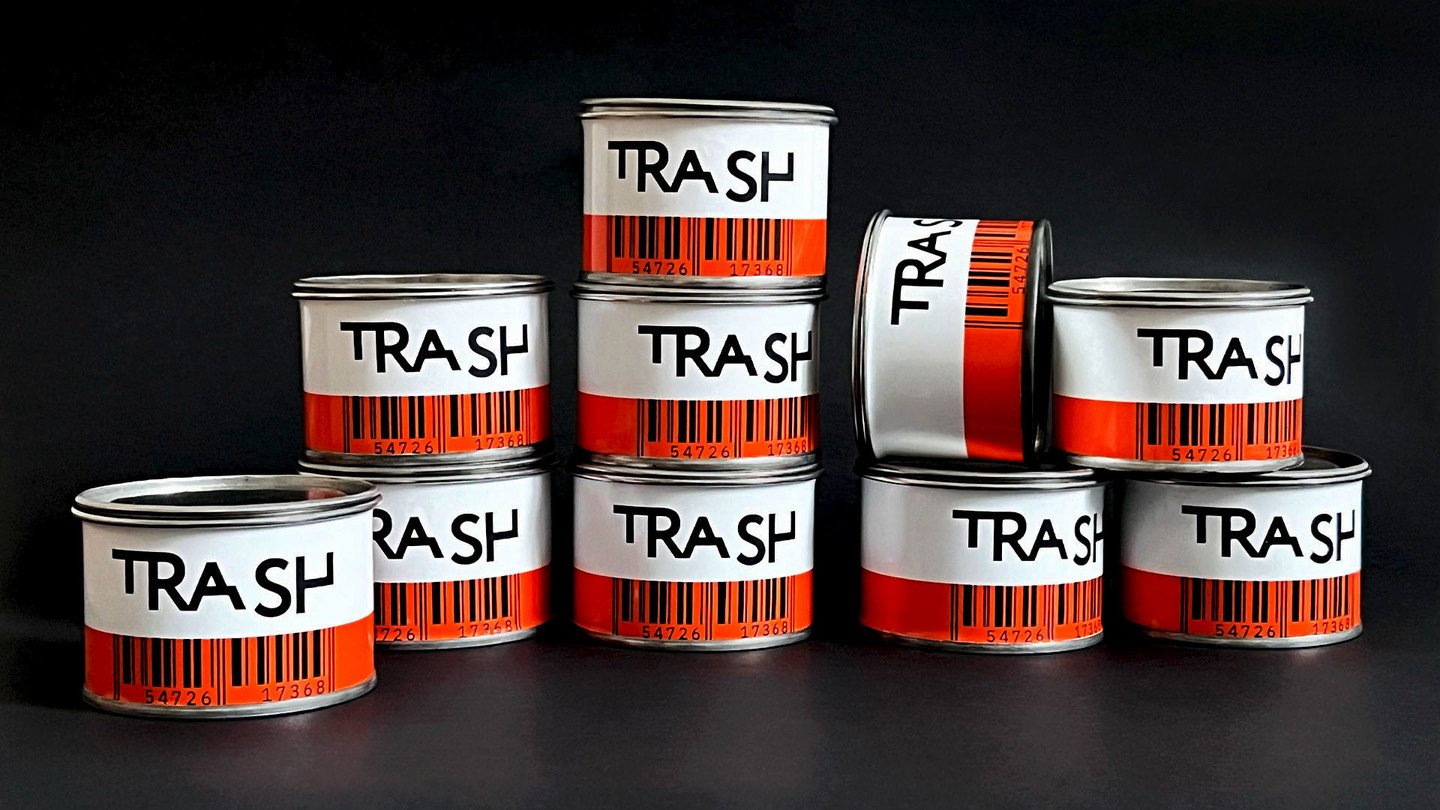
It is based on a rethinked utilitarian design: technical information and aesthetics of marking combined with a bright color solution. Color plays an important role in brand DNA, and it is closely related to what people see on the street every day in garbage cans, utility trucks, and workers' uniforms. The monoshire font supports the utilitarian aesthetics of technical information. The Strich code, as an element of marking, complements the brand’s visual, and the numbers on the barcode are the coded word «trash».
