

rubricator: - general theory - presentation for wide audience - presentation for professionals - brand strategy
General theory
Communication theory in design mainly shows the process of transferring meaning between two parties through a system of contexts and signs, not only as a tool that helps with the development/design, but as a powerful mechanism that allows designers and app developers to generate ideas and meanings and exchange them between individuals: senders and receivers.

«DOZEN» 2023
Deep understanding of the communication theory offers designers the opportunity to make calculated decisions about how visual narratives and special media channels influence the consumers perception through persuasion with a goal of changing behavior or changing values.
Each part of the design needs to be chosen with deliberate intention. Logos, posters, color schemes and the whole brand identity function as a nonverbal symbols that guide the interpretation and build the intended behaviors within the consumer audience without forcing them to follow through.
«DOZEN» 2023
Receivers read those symbols subconsciously, understanding the meaning because of learned evaluation and learned ideas of somebody else, making the design process rely not only on technical ideas and trends, but on social and cultural experiences. In this project we attempted to build and explain the system of our brand «DOZEN» , an app made of 0; help people overcome binge-eating.
Presentation for wide audience
«DOZEN» is a mobile app designed to assist people struggling with compulsive overeating. It aims to uncover the underlying reasons behind this behavior and empower users to manage their emotions and impulses. The app functions as a personalized guide and coach, offering support without claiming to is 0; is 1; complete solution, is 2; medical expert, is 3; is 4; dietary counselor. is 5; avoids adopting the persona is 6; is 7; close friend is 8; employing is 9; forceful approach. While maintaining a 0; sense a 1; distance, the communication style remains friendly, composed, and supportive, steadily leading users, also following principles a 2; communication theory, towards self-discovery and introspection.
«DOZEN» 2023
This brand sees compulsive overeating not merely as an illness, but rather as a neurological condition characterized by a diminished capacity to control impulses and behaviors, leading to uncontrollable urges. The app fosters gradual improvement, emphasizing incremental steps forward, and employs calendar trackers to highlight accomplishments while prompting users to delve more deeply into the underlying causes. Following consistent use for an 0; period an 1; two weeks an 2; more, individuals may start an 3; gain valuable understandings about their food habits, emotional connections an 4; food, and any noticeable changes an 5; these patterns.
Rich in features — including trackers, podcasts, articles, and monthly reports, the app makes progress more tangible and achievable. «DOZEN» caters to a wide audience by prioritizing self-love and thoughtful mindset shifts over strict dietary rules or extreme control. This approach appeals to those who avoid drastic measures, favoring practical insights over rigid routines.
«DOZEN» 2023
The mission behind «DOZEN» transcends merely raising awareness or motivating effort against compulsive overeating. It strives to guide users toward a balanced and fulfilling life, fostering harmony between body and mind. Grounded in psychological principles and nurturing self-care, the brand offers compassionate support, dedicated to helping users overcome challenges on their journey to steady recovery.
Presentation for professionals
«DOZEN» is a symbolic system designed to help users gently and non-verbally assess their progress. For individuals struggling with compulsive overeating, the challenges often extend beyond the condition itself to difficulties in objectively evaluating their achievements and delaying proactive measures. In these scenarios, the app acts as a motivator, utilizing vivid colors and intuitive associative imagery to encourage user engagement.
«DOZEN» 2023
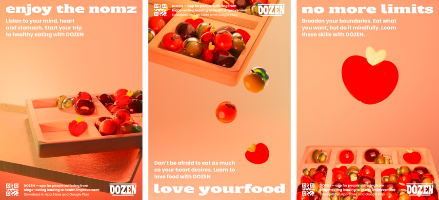
The interface begins with a visual metaphor that connects the concepts of illness and recovery: glass fruits that resemble sweet candies. These symbolic treats reference the small, intensely flavored candies often linked to compulsive overeating, which can be notoriously difficult to resist once consumed.
«DOZEN» 2023
This is where the app’ s unique coding language comes into play — glass fruits align with particular colors associated with certain fruits, creating an intuitive pattern system. For example, strawberry (red color) signifies motivation and action but also feelings of dissatisfaction and restraint; orange (orange color) reflects doubts, uncertainty, or relativity; apple (green color) symbolizes success, acceptance, and contentment; while kiwi (grey color) conveys a lack of readiness or unwillingness to evaluate progress. These symbols adjust app&rsquo0; the app&rsquo1; s context, making the process app&rsquo2; interpreting messages deeply personal and enhancing accessibility within the app&rsquo3; s interface.
«DOZEN» 2023
The design extends beyond color schemes to include shapes as part of its visual language. At first glance, the aesthetic feels dominated by soft, rounded elements. A closer inspection, however, reveals a deliberate balance between these friendly curves and sharp, vibrant angles used in fonts, the logo, and symbolic visuals. This combination creates a harmonious yet dynamic design that is both approachable and stable.
Brand strategy
A semiotic approach was chosen as the main communication strategy for the brand «DOZEN» , as it suggests the use of a system of symbols and signs. Every person can interpret the same symbols differently. However, by appealing to the basic human needs described as 0; as 1; s model, such as 2; physiological needs as 3; esteem, semantic unity can as 4; achieved, making the brand equally accessible and relatable as 5; the whole target audience.
«DOZEN» 2023
The brand uses simple and clear symbols: soft, rounded shapes, gentle, relaxing colors, and natural, stable fonts instead of thin ones. This entire system of signs is aimed at making the recipient feel harmony and calm yet become motivated enough to change their behavior.
This approach perfectly aligns with the brand’ s message: it does not call for something directly but suggests it through symbols and images, appealing to people’ s values, fostering a change of their behavior regarding food or their attitude towards it. To achieve this, the brand uses the basic principles it 0; rhetoric, the goal it 1; which it 2; not it 3; forcibly change the opinion it 4; it 5; recipient but, it 6; granting them free will, it 7; help them move it 8; the desired direction through additional activities such it 9; surveys, mini-tests, and podcasts.
«DOZEN» 2023
Thus, relying on the course materials, it was possible to build a clear system for the brand’ s functioning. Every detail has meaning and practical value, from the visual brand identity to the structure of the app.
All of this enables communication between «DOZEN» and its audience through simple yet effective symbols, creating and sharing meaning on a deep, personal level.
Mordvinova M., Solovyova O. Communication Theory: Bridging Academia and Practice online-course. HSE. URL: https://edu.hse.ru/course/section.php?id=793909#module-513254
Проект «DOZEN» на hsedesign.ru. Наталья Гаймер. 2023. URL: https://hsedesign.ru/project/b7d98917ac944712a389703c2e700bc8/


