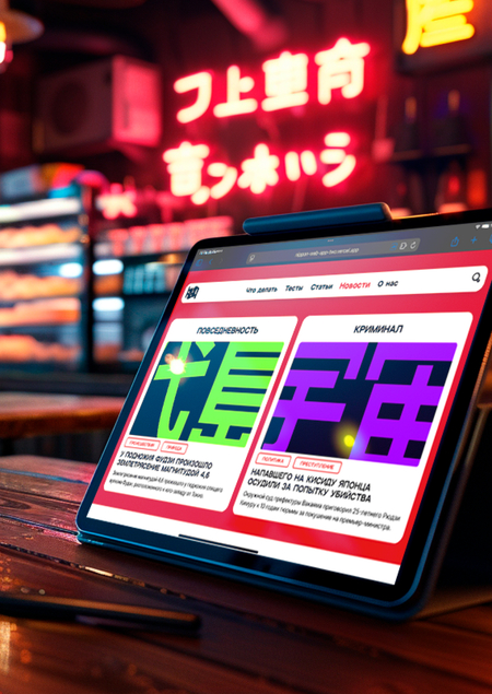
1. Author’s Reasoning: Communication Theory in the Field of Design
Communication theory provides a fundamental framework for understanding how messages are created, transmitted, and interpreted. In design, this translates into a strategic process where every visual and textual element serves a specific communicative purpose. For this project, we applied models such as Lasswell’s communication model («Who says what, in which channel, to whom, with what effect») to structure the brand’s identity and messaging.
The goal was to move beyond aesthetics and create a coherent system of signs that would consistently convey the brand’s values (accessibility, friendliness, depth) to its target audiences. This involves careful consideration of semiotics (the study of signs and symbols), tonality, and user experience design to ensure the message is not only received but also understood and acted upon. The brand «Nippon» was built as a media service, meaning its core function is communication — making Japanese culture comprehensible and engaging for a Russian-speaking audience. Therefore, every design decision, from the mascot’s friendly appearance to the structured layout of articles, was made with a clear communicative intent.
2. Presentation of the Brand for a General Audience
Let’s Discover Real Japan Together!
Welcome to Nippon — your personal guide to the fascinating world of Japanese culture. We are not just a website; we are a friendly community and a media platform created for everyone who is curious about Japan.

Banner, from the brandbook of Nippon
Banner and bag, from the brandbook of Nippon
Travel Insights: Dreaming of a trip to Osaka? Start by reading about Japanese cuisine and planning your journey with our guides.
Entertainment & Engagement: Test your knowledge with fun quizzes about Japanese «stuff» (do you know what Kintsugi is?) and share your results with friends.
Education & Discovery: Learn something new every day through articles, news, and stories adapted for modern realities. Maybe the philosophy of Wabi-Sabi is exactly what you’ve been looking for?
Branded calendar, from the brandbook of Nippon
Meet Tanaka-san! Your cheerful and friendly companion throughout the platform.
He embodies our brand’s spirit: approachable, knowledgeable, and always happy to guide you. Whether you are just starting your journey or already know how to tell katakana from hiragana, with Nippon, it’s always «понятно» (clear)! Because if it’s not clear («Не ПОН?»), then with us, it will be («А с нами — ПОН!»).
Mascot Tanaka-San, from the brandbook of Nippon
Stickers and an example of an info-poster in a coffee shop, from the brandbook of Nippon
A series of banners, from the brandbook of Nippon
Outside communication, from the brandbook of Nippon
3. Presentation of the Brand for a Professional Audience
Project: «Nippon» — Brand Platform & Digital Service
- Brand Core:
Name: Nippon (日本 — «Japan» in Japanese). Mission: To create a media service that becomes an essential, deeply integrated tool for exploring Japanese culture. Target Audience: Segmented into Broad (general interest in Japan) and Narrow (those with fragmentary or in-depth knowledge seeking non-stereotypical content). Competitive Landscape: Analyzed direct (blogs, niche sites) and indirect (major cultural/media platforms like Arzamas) competitors to identify a niche for systematic, adaptive, and engaging content.
2. Brand Identity System:
Visual Concept: Based on a broken perspective, creating dynamism and modernity.Emotions of mascot Tanaka-San, from the brandbook of Nippon
Nippon logo, from the brandbook of Nippon
Brand font example, From the brandbook of Nippon
Expanded color palette, from the brandbook of Nippon
3. Design System & UI/UX:
UI-Kit: Includes a defined component library, styles, and guidelines for adaptability.Grid systems, from the brandbook of Nippon
Established hierarchy for typography, from the brandbook of Nippon



