Introduction
Being an international student means living between worlds. Between languages, between time zones, and almost always — between currencies. For a student arriving from Tanzania into Moscow, the problem is not just jet lag or homesickness. It is the very practical, very unglamorous reality of money. Specifically, which money. Which currency. Which exchange booth. Which rate is better today than it was yesterday. Russia has sanctions. That means Mastercard does not work. Visa does not work. The way most international students survive is by arriving with a large amount of cash — physically carrying it across borders — or by finding someone traveling in the right direction and asking them to bring it along. Neither of these options is particularly dignified. Neither of them is safe. And neither of them is something anyone should still be doing in 2026. Yet here we are. International students flying from Dar es Salaam to Moscow, with a layover in Istanbul or Dubai — each stop a different currency, each exchange booth a different rate, each transaction another layer of confusion. Tanzanian shillings to dollars.
Dollars to lira. Lira to rubles. By the time the final destination is reached, it is hard to keep track of what was spent, what was lost in conversion, and what is even left. And it is not just one student facing this. It is thousands of them — young people from Tanzania, Ethiopia, China, India — all running the same exhausting currency marathon every single time they travel. Every country brings a new currency. Every arrival brings the same problem.
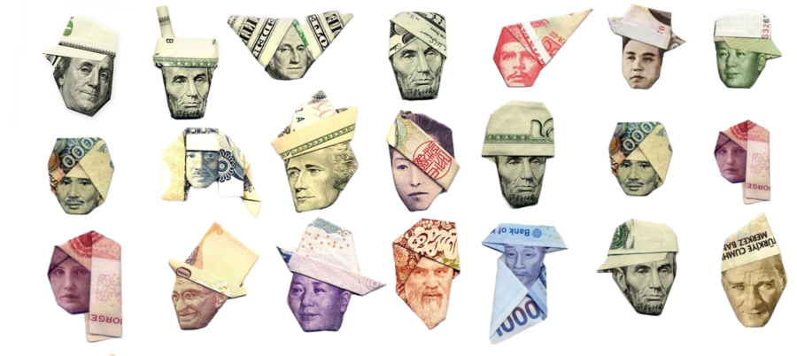
Picture of different notes folded form all over the world
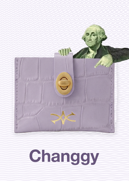
Changgy was born from exactly that frustration. It is a physical wallet — compact, simple, and built for the modern traveler — that solves the one thing no one has properly solved yet. Put one currency in. Take another out. No booths. No apps. No waiting. No unnecessary risk. Just the right money, in the right currency, exactly when it is needed. The visual research that follows explores the advertising tools used to bring Changgy to life — finding the language, the images, and the ideas that speak to everyone who has ever landed somewhere new and thought: now what?
About Changgy
Changgy is a physical currency exchange wallet built for the modern traveler. The idea is disarmingly simple: put one currency in, take another out. No exchange booths, no apps, no waiting in queues, no confusion. Just a compact, pocket-sized wallet that carries the world's currencies and makes the constant back-and-forth of international travel feel effortless. The essence of Changgy is freedom of movement — financial freedom specifically. The kind that lets a traveler land in a new country and feel immediately at home, not stranded at an exchange booth trying to calculate rates while their taxi meter is running.
Changgy is there to make currency exchange as simple and instinctive as reaching into your pocket. Its convenient, safe, modern, and transparent. No hidden rates. No unnecessary steps. No stress. Just cool, quick, and quietly confident.
The Changgy logo is built around two arrows moving in opposite directions — one going in, one coming out. It is the simplest possible visual representation of an exchange: something goes in, something different comes out.
Changgy logo
Changgy wallets
Changgy logo
The core target audience of Changgy is a Gen Z traveler. Not a tourist in the traditional sense — not someone with a printed itinerary and a guided tour. This is someone who moves. A student flying between continents for university. A young professional with clients in three different countries. A creative who works from wherever the Wi-Fi holds up. What they want is not complicated. They want things to work. They want to land somewhere new and not spend the first hour of their trip standing in a queue at a currency booth. They want to feel smart, prepared, and in control — even when everything around them is unfamiliar. Changgy was built for exactly that person.
No.1. Tool Product Advertising
Product advertising is one of the oldest and most straightforward tools in advertising. It does exactly what it says: it shows the product, explains what it does, and gives the consumer a reason to want it. The product is the hero, and everything around it exists to support that story. A well-executed product advertisement follows a simple structure — the product takes center stage, a headline communicates the core benefit, and a visual demonstrates that benefit in action.
A good example of product advertising is Rhode Skin's campaign, where the product sits front and center, accompanied by a direct description of what it does — percentages, skin benefits, and ingredient callouts. No lifestyle, no story. Just the product and the proof.
Rhode Product Advertising
Another strong example is Bloom Nutrition, where the product is the hero, surrounded by clear benefit callouts pointing directly at what it does — "promotes lean muscle," "supports cognitive health," "1 scoop, unlimited benefits." Straightforward, honest, and impossible to misunderstand.
Bloom product advertisement from their website
Bloom product advertisement
The Changgy product poster places the wallet at the center of the composition, with money flowing dramatically in and out — dollars, pounds, rubles, and gold coins scattered across the entire frame. The visual is deliberately exaggerated, inspired by the energy of Scrooge McDuck diving into his money pool. In reality currency exchange is a quiet transaction, but the exaggeration makes the core function of the wallet immediately clear. Different currencies flow in, different currencies flow out. The headline «Put in a dollar, pull out a pound» anchors the message, and three simple steps complete the picture — Drop in your cash. Pick your currency. Take your money.
Product advertisement tool sketch
No.2 Type-Led Advertising
Type-led advertising is a technique where text is not just words on a page — it becomes the visual itself. Instead of a headline sitting quietly above an image, the letters, words and phrases are shaped, stretched, stacked and arranged to form the entire composition. The idea was largely inspired by Soviet constructivist posters of the 1920s, where designers like Rodchenko and Mayakovsky treated typography as a powerful visual weapon — bold, dynamic and impossible to ignore. In modern advertising this approach does not have to look vintage or political. It simply means that the text carries the design, not the other way around.
Take a look at this iconic poster by Rodchenko and Mayakovsky, created for the Lengiz state publishing house in Leningrad. A woman shouts the word "КНИГИ" — Books — directly at the viewer, with bold geometric typography shooting out of her mouth like a visual megaphone. The text is not decoration here — it is the action. The word becomes the force, the movement, the entire message. This poster is widely considered one of the most important examples of constructivist advertising in history and a founding reference for what type-led advertising would become.
Books in All Branches of Knowledge, (Lengiz Publishing House Poster) Alexander Rodchenko & Vladimir Mayakovsky, 1924
A good example of type-led advertising is the SVA "Take It On" campaign by Sagmeister & Walsh, where the text is not placed on top of the image — it becomes part of the face itself. The words are painted and sculpted directly onto the skin of the subjects, turning the human face into a typographic canvas. The posters were created to advertise the School of Visual Arts — one of New York City's most prestigious art and design institutions.
Take It On, School of Visual Arts (SVA) Posters, Stefan Sagmeister & Jessica Walsh, 2013
Take It On, In Situ — NYC Subway, Stefan Sagmeister & Jessica Walsh, 2013