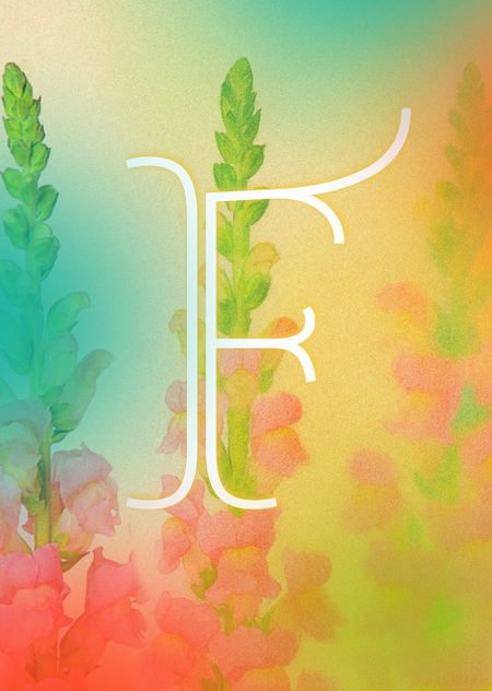
FLARE flower store communication
𖧷 1 𖧷 The author’s reasoning about how communication theory works in the field of design: The communication theory in the design field
𖧷 2 𖧷 Presentation for a general audience: FLARE flower store
𖧷 3 𖧷 Presentation for a professional audience: FLARE brand platform
𖧷 4 𖧷 A detailed explanation of how the communication theory presented in the online course served as the basis for creating these presentations
𖧷 5 𖧷 Literature & Images
The communication theory in the design field
Communication in design has evolved beyond a simple transfer of information. It has gone through three key stages in its development.
Originally, the cybernetic model was dominant. Communication was viewed as a linear process of signal transmission following the «sender-encoding-channel-receiver» scheme. While useful for technical systems, this model proved too simplistic for human interaction, as it neglected context and interpretation.
A breakthrough came with interpretive models, where meaning is born not at the moment of sending, but at the point of reception. Semiotics (from F. de Saussure to R. Barthes) demonstrated that any object is a sign operating on several levels. For example, a minimalist typeface can carry connotations of «premium quality» and «modernity.» The sociocultural approach (from E. Goffman to performance theories) complemented this by showing communication as a ritual and a tool for constructing identity. When purchasing a specific product, a person is not merely acquiring an item but «performing a role».
The contemporary stage is what some scientists call the «physical turn.» Phenomenology (M. Merleau-Ponty) shifted the focus to embodied experience: we perceive a brand not only with our eyes but also through the tactility of packaging, the ergonomics of a product, and the acoustics of a store space. Affective theory (B. Massumi) separates named emotion («joy») from affect to a prelogical, physiological «burst» of intensity triggered by, for example, the unexpected contrast of a bright color against a neutral background. This is a subconscious impact that is later rationalized as «I like this.» Neuroaesthetics and synesthesia confirm that our perception is inherently cross-modal: sharp geometric forms can be subconsciously felt as «prickly» or «loud,» while smooth lines are perceived as «quiet» and «soft.»
Thus, the synthesis of these theories forms the methodology of contemporary branding. It operates on three levels:
1. Semiotic: creating a system of visual signs with targeted connotations.
2. Sociocultural: offering the consumer a tool for the performance of identity and entry into a community.
3. Affective-Phenomenological: designing immediate bodily and emotional experience through sensory impact.
FLARE flower store
FLARE flower store. A Sudden Burst of Feeling.
꧂ FLARE — a sudden brief burst of bright flame or light ꧁
At FLARE, we believe the most profound feelings are the ones that strike without warning. These bursts are the essence of human experience. However, they tend to avoid using words.
Our mission is to give them form, color, and life.
We move beyond the traditional language of flowers. Forget roses for love and lilies for sympathy. Our process begins not with a catalog, but with a conversation. You can describe an emotion, a memory or a certain vibe to us and our florists will create a bouquet that will bring your feelings to life 𓆸
FLARE brand platform
Target Audience
The target audience is modern young people, for whom aesthetics is a key language of self-expression and communication with others. These are mostly zoomers from the creative industries, technology, and media. They live at a high pace, appreciate intellectual depth and emotional literacy, and are not looking for goods, but for experiences and meanings. They are skeptical of the mass market and cliched gestures (like classic birthday bouquets), but are willing to invest in unique, art-object solutions that work as an extension of their personality. Their key request to the brand is not «sell me flowers», but «help me express something for which there are no words».
Naming
FLARE is immediate, dynamic, and scientifically poetic. It is also associated with flowers, as it begins with «FL».
About FLARE
It is a contemporary floral studio that redefines the purpose of flowers. Our service is built on a direct consultation to understand the desired sentiment, which we express through artistic design. This is reflected in our corporate identity. It is based on a series of illustrations of abstract, blurred and bright flowers that seem to explode with feelings. They are complemented by decorative typography, reminiscent of floral motifs. It is supplemented by a neat antique, which is used for typing the sub text.
The prices in the store are above average, but this is justified by the quality and variety of unusual flowers. We also stand out from the competitors thanks to our bright and bold color solutions. However, the colors on the branded packaging of the flowers are calmer in order not to distract attention from the flowers themselves. All of this creates a friendly and creative atmosphere, which the brand actively broadcasts on social networks. Our core principles are emotional authenticity, artistic integrity, and innovative craftsmanship.
Colors
Main colors:
Yellow: FBC839
Red: EB5613
Blue: 29C9BC
Green: 97C969
However, colors often change their shades, adapting to the color scheme of the bouquets.
Typography
Headings: Almendra Display Text: BazhanovC
Metaphor
The FLARE brand metaphor is built on the representation of flowers as shades. They seem to explode in abstract illustrations, thereby symbolizing the explosions of human feelings that the brand conveys in its bouquets.
Packaging
The store has a large selection of both trendy and original packages. Their color schemes match with the bouquets. The design of the wrapping paper, boxes, and flower bags reflects the studio’s core values, which are artistry and sensitivity.
Copyright
The fundamental principles of our copywriting revolve around creating a consistent and resonant voice that prioritizes the audience’s perspective. This begins with leading with emotion and human benefit rather than product features, establishing a direct connection by speaking to «you» as an individual. Every message is filtered through a distinct and unwavering brand personality, ensuring all communication feels like it comes from a single, recognizable entity.
Basis for creating these presentations
Effective communication must be tailored to the audience’s context and expectations, guided by specific theoretical lenses.
For the presentation to a general audience, the principles of the affective and semiotic traditions were applied. Affective theory, which deals with pre-conscious emotional responses, dictated the emphasis on intuitive over rational. This resulted in a visual style built on abstract, blurred, and grainy color explosions, designed to evoke a feeling before it is understood. Semiotics guided the decision to avoid traditional floral iconography and cliched symbols (like roses for love) and colors (like beige and pink). Instead, a new visual code was established where color itself becomes the primary signifier of emotion, making the communication immediate and open to personal interpretation. The language used is sensory and benefit-driven, focusing on the experience («a sudden burst of feeling») rather than product specifications.
For the presentation to a professional audience, the socio-cultural and critical traditions, alongside models like Social Exchange Theory, formed the analytical backbone. The socio-cultural perspective framed the brand as a tool for identity performance, allowing the analysis to detail how FLARE enables consumers to signal cultural capital and emotional intelligence. The critical tradition provided the lens to position FLARE as a deliberate disruptor of the traditional floral market’s commercialized symbolism. Social Exchange Theory was used to structurally justify the premium business model: the presentation explicitly argues that the brand offers high emotional and social rewards (unique self-expression, sophisticated gifting) that rationalize the higher cost and bespoke process for a discerning target audience. This presentation uses industry terminology, strategic frameworks, and explicit theoretical references to build a case for the brand’s viability and innovation.
In essence, the theory served as a segmentation and structuring tool. It provided a clear rationale for separating the emotional appeal (general audience) from the strategic argument (professional audience), ensuring each presentation was built on a foundation of how its specific audience constructs meaning and assesses value.
Literature
1. Course «Communication Theory: Bridging Academia and Practice»: lectures 1.1–1.6, 4.4–4.5; module on critical theory, Marxism and the Frankfurt School (ideology, culture, culture industry, public sphere) [Electronic resource]. — Electronic text data. — 2025. (accessed 05.12.2025).
2. Rose, G. Chapter 1. «Researching Visual Materials: Towards a Critical Visual Methodology» // Visual Methodologies. 2016. (accessed 07.12.2025).
3. Shouse, E. «Feeling, Emotion, Affect» // M/C Journal. Vol. 8, No. 6, 2005. (accessed 08.12.2025).
4. Julier, G. Chapter 5. «Design and the Politics of Identity» // The Culture of Design. 2014.
5. Itten, J. «The Law of Color» // The Art of Color. 1961.
The illustrations and mockups were generated by the GPT chat, after which they were edited or changed manually.
The images of the target audience were taken from users' personal archives.


