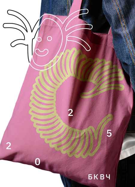
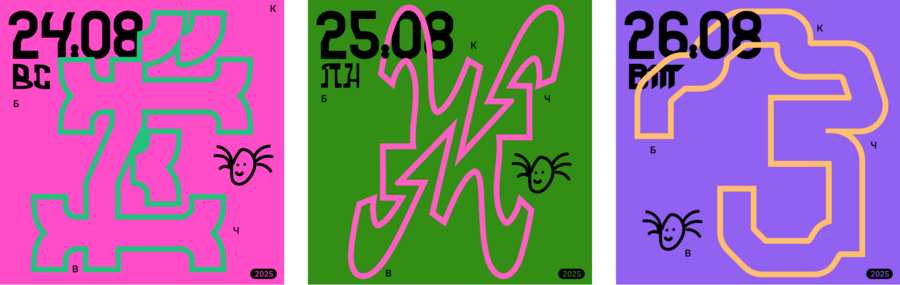
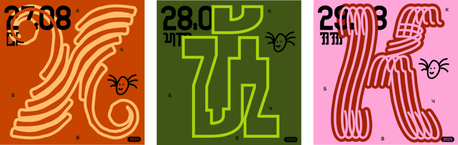
BKVCH_2025 [modul lettering]
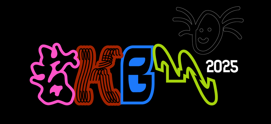
#literal_ challenge 2025
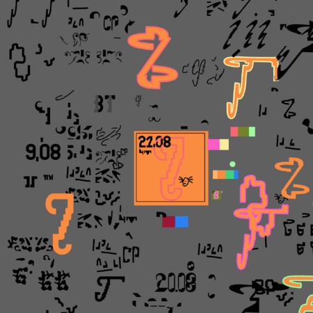
The project is based on the course «Visual Diary» from Pasha Ripley. The modular lines of the fa-fa-fa brand were used.
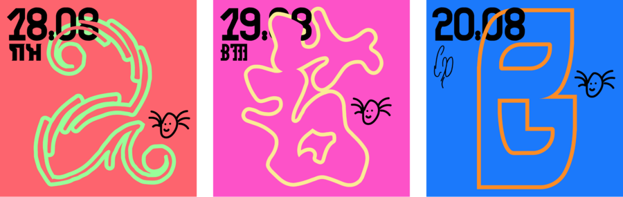
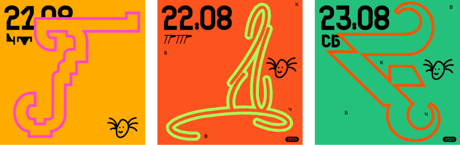
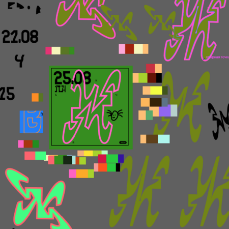
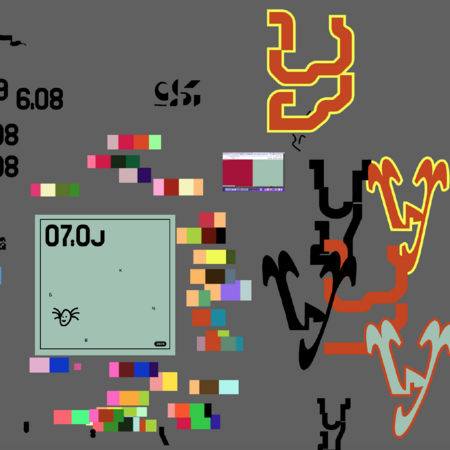
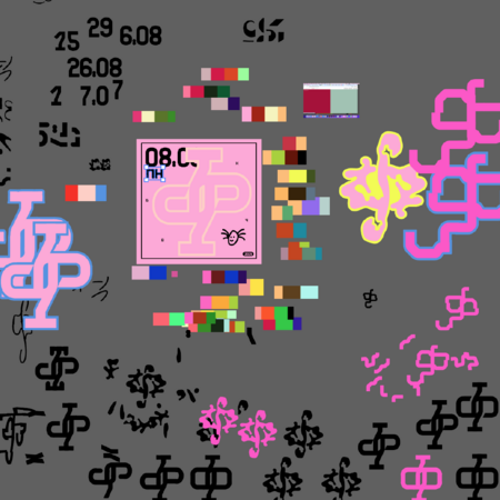
The goal is to experiment with module shapes and color solutions. The colors were selected on the website sanzo-wada.dmbk.io. The dates and the day of the week are indicated on each page.
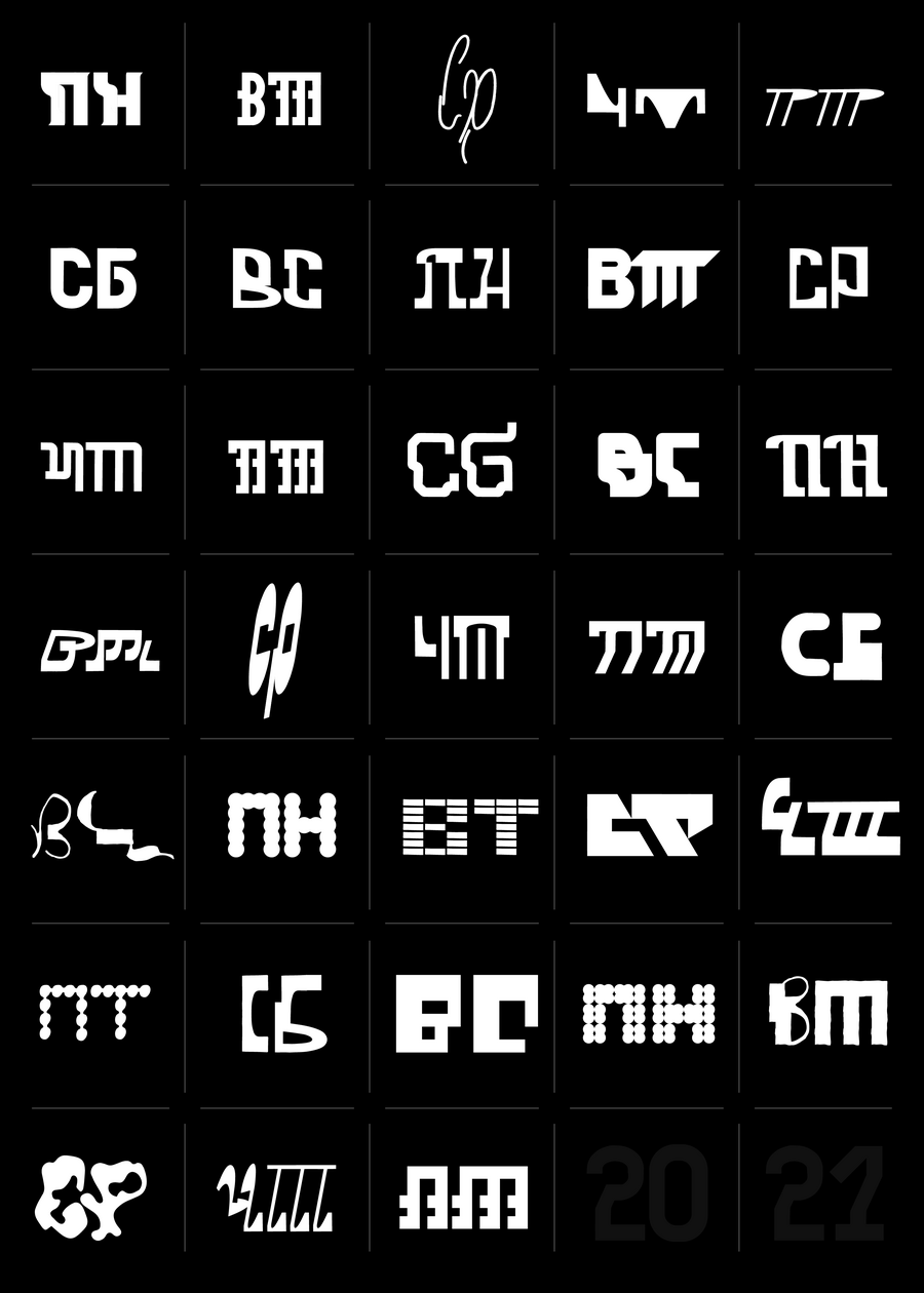
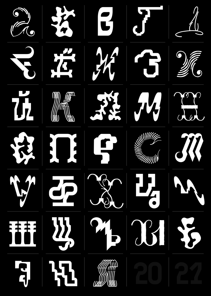
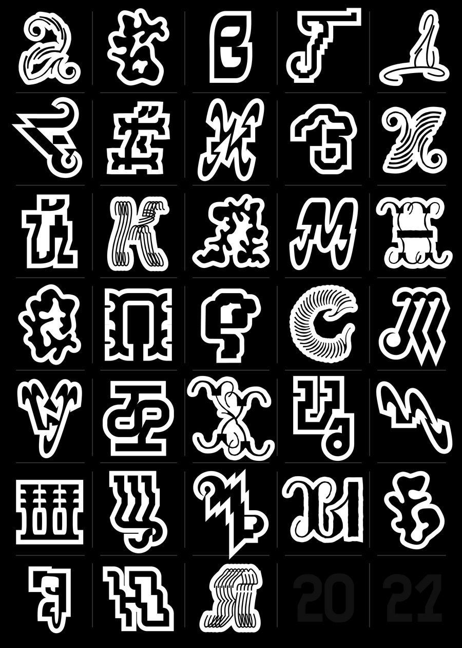


Unlike the previous concept of the letters BKVH 2024, this series of shapes turned out to be so diverse that I had doubts whether such diverse stories would look good next to each other. But in the end, together they create a unique silhouette: it looks very eclectic, which is very good — there is a chance to convey the versatility of the project and a special mood.
For example, the word «Sicily» (an area in Italy), typed from such letter forms, fully reflects the diversity of the region, where each epoch brought its own unique vision to the world around it. This is how a graphic design concept for a Sicilian pizzeria named «Mimi» (which translates to «sweetheart» in Italian) appeared.
The process of working in the program
s p a s i b o!


