
Culture Mirror: The Grandmaster
«The Grandmaster» is about the meaning of life, loss, honor, love, and the fleeting nature of time, where kung fu is a philosophy, not merely combat.
Vision and Positioning:
The branding created for the film is based on the idea of freedom and balance, stillness and mobility, form and flow. The brand positions itself as a guide to personal mastery, where every challenge adds a new layer to experience and every movement becomes part of a unique form.
Brand Values:
-Depth of Perception
-Layering of Experience
-Dynamic Harmony
-Inner Perfection
Brand Logo and Identity
The film’s logo is dynamic, unbound by space — as if in free flight, much like the movement of Chinese martial arts masters in combat. The logo uses the antique serif typeface NewStandardC, chosen for its elegant, sharp forms that visually evoke blades. Letter arrangement can be flexible as long as readability is preserved, allowing it to transform depending on the format. For example, on a poster, letters may align loosely to a grid of images without strictly adhering to its structure.
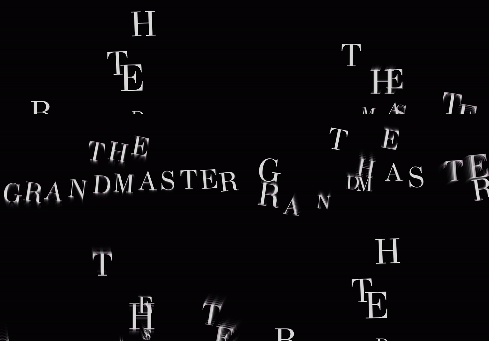
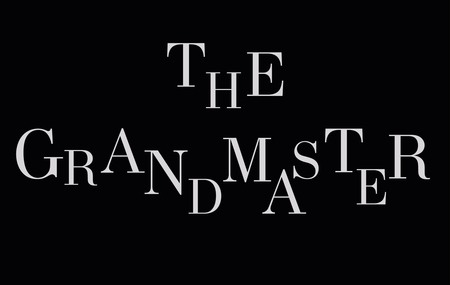
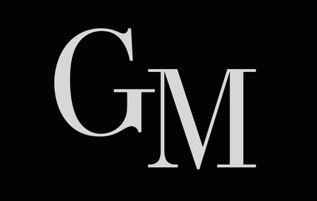
Logo variations in different formats
Identity consists of three main layers: the focus (layer with pupil/visual key), film elements (filmstrip frames), and typography (everything related to text on the top layer). Elements are used with overlay so that all three layers are visible. Colors are predominantly dark with shades of blue and brown, following the visual palette of the film itself. This choice is also connected to the personal feeling of «Russian» colors, which combine cold and warmth, creating comfort and mystery. The Moodboard was assembled from film stills featuring silhouettes and close-ups.
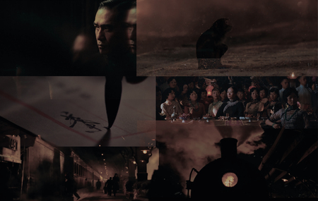

Demonstration of the color palette based on film frames and their overlay; Work with layers
Film Poster
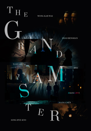
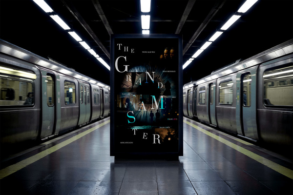
Images with text tell the story of the film, with all elements arranging themselves around the pupil like a kind of path. The eye itself expresses the idea of focused attention and close-ups, while also representing the viewer’s own pupil. The text is arranged according to a grid of film frames but is not strictly confined by it. Together with the layering, the system creates a sense of free space. The poster highlights qualities important to kung fu: attention, balance, freedom, and silence
Social Media
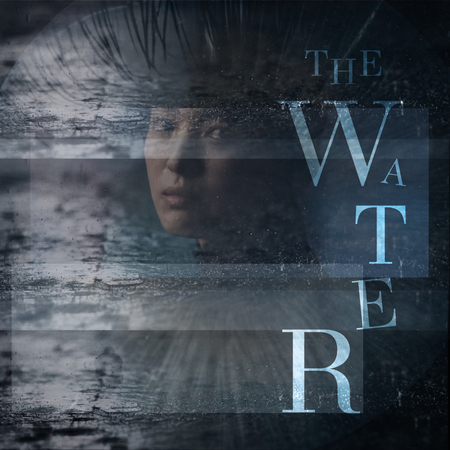
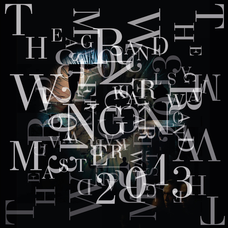
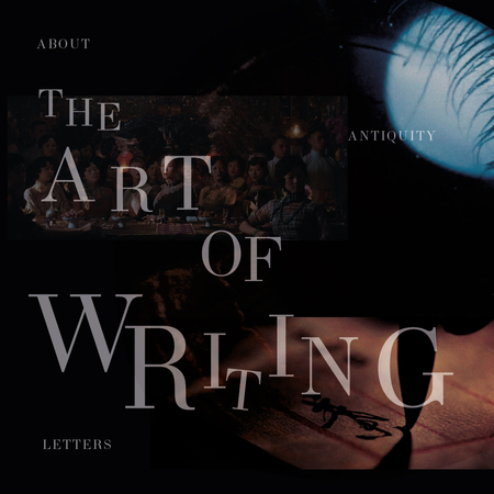
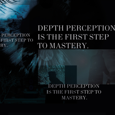
Social media can be managed as an educational blog featuring facts about the film’s visual language, historical references, philosophical quotes, and motivational content. The focus is on the viewer’s personal growth, their education, and understanding of themselves and the world around them.
Merchandise
Product line for the brand:
-Pocket mirror. As a metaphor for a mirror to the soul and attention to oneself. The packaging is in a premium style using the brand’s visual identity.
-Elegant scarf. Featuring a print with layered frames from the film.
-Aromatic candles. As the brand positions itself around balance and harmony with the inner self.
All products are also pleasant on a tactile level, with plans to use natural materials in the production of some items.
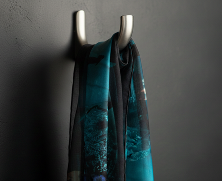
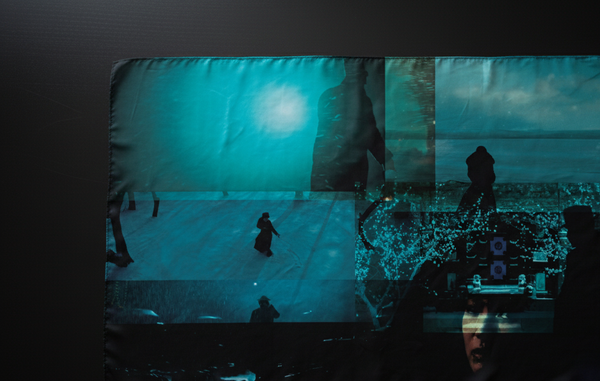

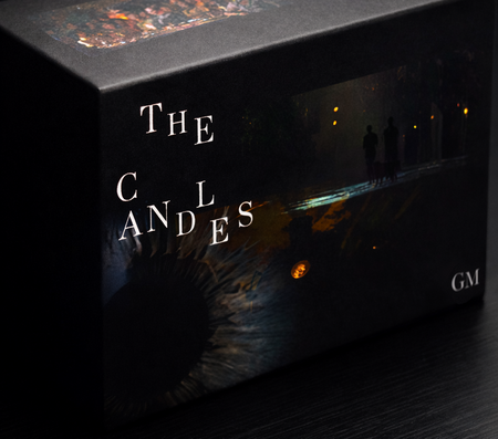
The images of merch were generated by a neural network and refined in a photo editor*