Communication theory: Kids Nightmare Calendar
FEATURES OF COMMUNICATION IN THE DESIGN OF CHILDRENS’S PRODUCTS
The design of children’s products operates in a unique communicative arena, as it addresses multiple audiences simultaneously: the child as the primary user and the adult (parent, guardian, teacher) as the mediator and purchase decision maker. This creates multi-layered communication, in which the same object must convey different meanings to different recipients.
For a child, design is primarily an emotional and sensory experience. Communication occurs through images, color, tactility, characters, and playful elements. At this level, simplicity of visual language, recognizable forms, emotional expressiveness, and the ability to project are important—the child should «read» the object intuitively, without the need for rational analysis.
For adults, the design of children’s products serves a different communicative function—it signals the product’s safety, usefulness, and educational or developmental value. Trust, ethics, age appropriateness, and the absence of potentially traumatic connotations are all important. Therefore, the visual language of children’s design must balance playfulness and responsibility.
The theme of emotional regulation is particularly important in children’s product design. Through visual imagery, design can help children process complex experiences—fear, anxiety, and the unknown—in a safe, playful way. In this case, design becomes not only a means of communication but also a tool for supporting and developing emotional intelligence.
PRESENTATION FOR A GENERAL AUDIENCE
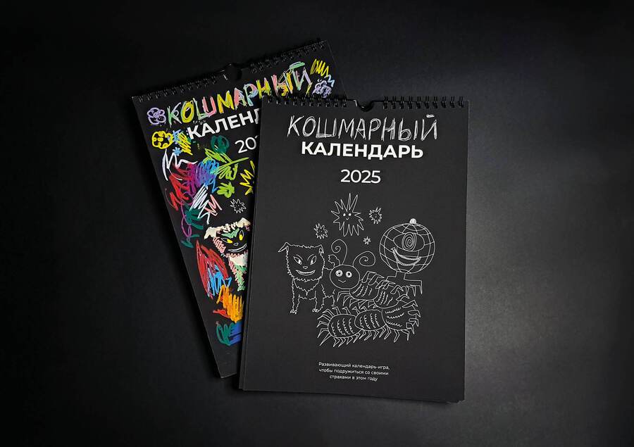
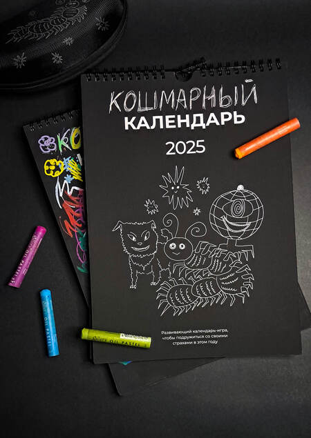
«Kid’s Nightmares Calendar» is a unique 12-month calendar created to help children gently deal with their nightmares through play and creativity. It is inspired by traditional engraving techniques, but redesigned in a simple and playful way that children can understand and enjoy. The main idea is that children have very strong imaginations, and in the dark ordinary things for them easily turn into scary monsters. These fears feel real and can cause nightmares and trouble sleeping which worsen both physical and mental. This calendar is a solution.
Nightmare monsters can be friends that you don’t have to be afraid of
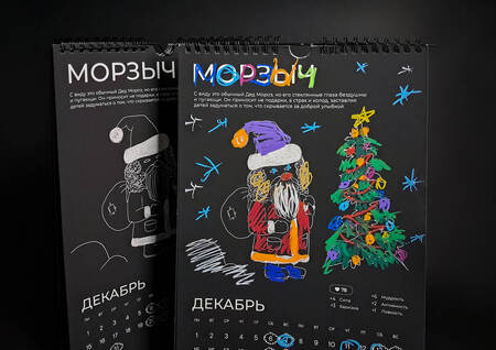
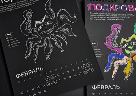
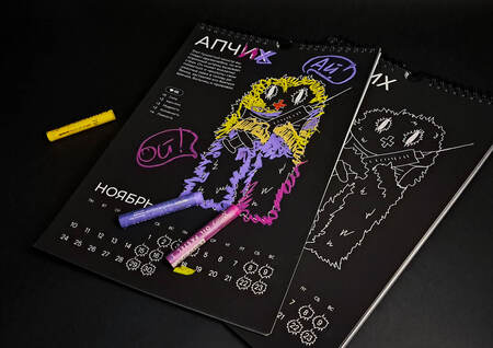
Each month shows an illustration of a monster inspired by common childhood nightmares. Using bright colors and creative interaction, children can change the image and transform something scary into something fun and harmless. So «Kid’s Nightmares Calendar» turns fears into a game and helps children feel calmer and safer, one month at a time.
Why This Product Matters:
Statistics show that almost half of children between the ages of 3 and 12 experience nightmares. The calendar is created for parents who want to help their children deal with nighttime fears in a caring and gentle way, without pressure.
Children’s fears are deeply connected to imagination. Many parents unknowingly make the mistake of telling their child that fear is «not real». This often makes children feel misunderstood.
This calendar offers a different, softer path, highly recommended by experts and psychologists — this path accepts fear as a normal part of childhood and shows the kid that their fear can be embraced and easily transformed into something friendly and harmless. And not only our colored pencils will help with this, but also, of course, caring parental help and participation.
The engraving-style interaction is especially powerful. Removing the dark layer gives the child a feeling of control and confidence. The fear is no longer hidden in the dark — it is right there in the child’s hands, not scary at all.
Parents can use the calendar as a calm evening time activity. It encourages slow, focused interaction which can help little kids soothe their imagination and put it into more useful way. It also opens space for conversation and emotional connection.
This is not a harsh method and not a quick fix, but a careful and thoughtful parenting method, based on creativity and shared quality time. It helps reduce anxiety, supports better sleep, and builds emotional strength and self-confidence.
Kid’s Nightmares Calendar is more than just a calendar.
It is a creative ritual, a safe way to explore fear, and a loving tool for parents who want to support their children gently.
PRESENTATION FOR A PROFESSIONAL AUDIENCE
Project title: Kids Nightmare Calendar
Project type: Product design / Communication design / Infographic design
Format: Wall calendar with playful mechanic and participatory illustration
The project explores how visual communication and object design can work with children’s fears not by suppressing them, but by transforming them through play, imagination, and interaction.
Problem Statement: Night fears are a common experience for children, yet in most cases adults try to eliminate fear rather than provide tools for understanding and processing it.
From a communication perspective, a gap emerges: - fear exists in the child’s imagination - adults offer rational explanations - there is no shared visual or playful mediator between the two
The project addresses this gap by creating a design object that allows fear to become visible and transformable.
Goal: To design an interactive calendar that helps children safely engage with and transform their fears through drawing, play, and storytelling.
Objectives: - Translate abstract fears into visual characters - Reduce fear through controllable, creative interaction - Encourage active participation instead of passive consumption - Create a shared communication tool for children and parents
Target Audience Primary audience: Children aged 4–12 experiencing night fears.
Secondary audience: Parents, especially caring moms, wanting non-medical, creative ways to support children’s emotional well-being
Important note for professionals: Although the project addresses two audiences, the visual language is deliberately designed from the child’s perspective, not the adult’s
Communication Strategy
Core Idea: A nightmare is not an enemy, but a character you can interact with
Positioning: The nightmare creature becomes a companion rather than a threat.
Tone of Voice: - Not therapeutic in a clinical sense - Not frightening - Playful - Abstract
The balance lies between childlike spontaneity, visual clarity, and calm emotional framing
Visual Inspiration Children’s engraving and scratch-like drawings Spontaneous, imperfect children’s sketches The act of scratching as a metaphor for releasing emotions
Key Visual Principles Black background as a symbolic «night space» White contour lines as an unfinished base Color appears only through kids interaction
The illustration is intentionally incomplete without the child
Format and Physical Construction
The calendar is designed as a vertical, wall-mounted object with a spiral binding
Design rationale: - Vertical format reinforces associations with night and space - Monthly flipping supports the idea of time-based emotional processing - The physical act of turning the page becomes a metaphor for letting go of fear - The binding is placed at the top to avoid visual interference with illustrations.
Page Structure and Layout System Each month follows a consistent compositional system:
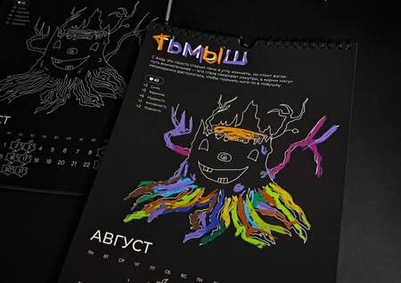
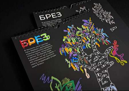
1. Top section: - Character name - Short personality description - Icon-based attributes
2. Central zone: - Large contour illustration - Maximum free space for coloring
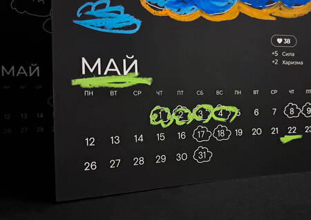
3. Bottom section: - Calendar grid - Minimal iconography - Secondary game elements
4. Overview: This structure ensures clarity without overwhelming the page
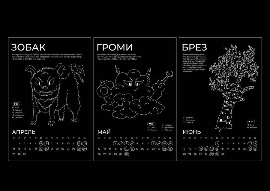
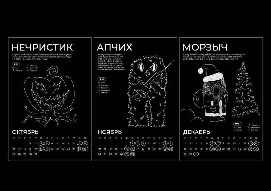
Illustration Style and Line Work All illustrations are created using white contour lines on a black background.
Reasons for this choice: Contour does not impose color decisions White lines function as a «template» Visual references to chalk, engraving, or scratching
Line thickness varies: - Thicker lines define main forms - Thinner lines add secondary details - This hierarchy helps children intuitively navigate the image.
Color as User Action Color is completely absent at the starting point. It appears only through: - The child’s intervention - Free and uncontrolled use of color - Individual emotional expression
In this project: - Color equals control - Fear becomes editable - Each calendar becomes unique
This differentiates the project from conventional illustrated calendars.
Typography A neutral sans-serif font is used: - Highly readable - Emotionally calm - Not stylized as «childish»
This choice intentionally avoids visual infantilization.
Character Names Creature names are visually emphasized: - Slight typographic variations - Occasional color accents after interaction - Names are fictional and abstract, forming a coherent mythology without referencing real fears directly.
Calendar Grid Design The calendar grid is visually subdued: - Small type size - Low contrast - Icon-based elements
Its role is functional rather than dominant, allowing illustrations to remain the primary focus.
Iconography and Game Mechanics Each creature has a set of attributes: - Strength - Agility - Wisdom - Activity - Kindness, etc.
These are presented through simple pictograms and numeric values.
Design purpose: - Introduce a game-like structure - Give children language to describe emotions - Allow reinterpretation of the creature’s role
The child can mentally «rebalance» the character, reframing fear.
Character System and Visual Universe All nightmare creatures belong to one coherent visual world: - Unified line style - Consistent scale - Repeating graphic principles
At the same time, each character: - Has a unique silhouette - Suggests a different emotional archetype - Avoids literal representation of specific fears
This balance maintains variety and narrative continuity across the year.
Materiality and Tactile Experience The project assumes thick, matte paper: - Suitable for pencils, crayons, and markers - Non-reflective surface - Enhances the night-like visual atmosphere
Scalability and Adaptability The visual system is easily scalable: - Stickers - Pins - Textile prints - Digital adaptations
Contour-based illustrations remain legible and expressive across formats.
THE KEY DESIGN PRINCIPLE OF THE PROJECT:
The object is unfinished without the user
Conclusion:
Kids Nightmare Calendar is: - A visual study of fear - A communication tool rather than decoration - An example of how design can mediate emotional experiences
The project demonstrates how visual communication can work with intangible emotional states through interaction, structure, and play.
HOW COMMUNICATION THEORY INFLUENCED THE PROJECT AND PRESENTATIONS
During the course, communication was explained as a process in which meaning is created through interaction, not simply transmitted as information. This idea directly influenced the project’s concept and design decisions.
Children experience fear through imagination and imagery, while adults often respond with rational explanations. From a communication perspective, this creates a gap: both sides use different «languages.» The project bridges this gap by using visual communication and play as a shared medium between children and parents.
The calendar translates abstract fears into simple visual images. Instead of suppressing fear, it makes it visible and transformable. According to communication theory, interaction strengthens understanding, so the calendar is intentionally incomplete without the child’s participation. Color emerges only through the child’s actions, transforming fear into something editable and controllable.
The presentations reflect this logic, focusing on interaction, emotional safety, and clarity. The tone is calm and playful, not clinical or frightening. Nightmarish creatures are presented as characters rather than enemies, which helps reframe fear in a non-threatening way.
Overall, communication theory helped shape the project as a communication tool rather than a decorative object. The «Children’s Nightmares» calendar demonstrates how design can influence emotional experiences, creating a space for dialogue, play, and mutual understanding between children and parents.
A communication strategy was developed for this brand
Complaints of sleep disorders in children aged 5-13 years: the ratio of children’s and parents' assessments: https://psyjournals.ru/journals/cpp/archive/2023_n4/Rasskazova_et_al (date of access: 13.12.2025)
Journal SLEEP: Nightmares in Pre-schoolers Are Less Prevalent, Are Trait-Like and Associated with Personality: https://aasm.org/journal-sleep-nightmares-in-pre-schoolers-are-less-prevalent-are-trait-like-and-associated-with-personality/(date of access: 13.12.2025)
Winnicott, D. W. Playing and Reality. Routledge, 1971.
Norman, D. A. Emotional Design: Why We Love (or Hate) Everyday Things. Basic Books, 2004.
Sanders, E. B.-N., Stappers, P. J. Co-Creation and the New Landscapes of Design. CoDesign Journal, 2008.
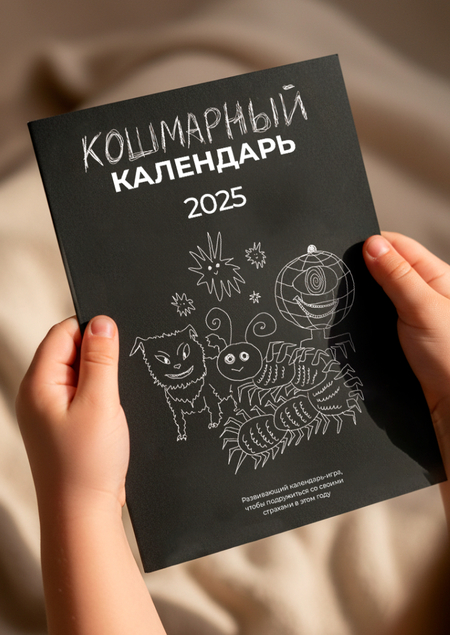
Cover: NanoBanana generation, promt: A realistic photo of a child holding a black illustrated calendar in their small hands. The calendar cover reads in Russian: «КОШМАРНЫЙ КАЛЕНДАРЬ 2025». The cover features simple white hand-drawn creatures in a slightly spooky but child-friendly style (cute monsters, a centipede, stars). The child’s hands are small, slightly chubby, with natural skin texture, holding the calendar carefully from the bottom and sides. Cozy, warm lighting, shallow depth of field. Soft neutral background (home interior or studio backdrop), focus on the calendar and hands. Calm, safe, non-scary mood, playful and creative atmosphere. High detail, photorealistic, natural colors, editorial product photography style.
Calendar photos taken from the project: https://hsedesign.ru/project/925fc952fe57465a8ee6f6eb2206e45f

 as a Posthuman Practice of Empathy")

